the Creative Commons Attribution 4.0 License.
the Creative Commons Attribution 4.0 License.
 | 17 Aug 2023
Visual analysis of model parameter sensitivities along warm conveyor belt trajectories using Met.3D (1.6.0-multivar1)
Christoph Neuhauser
Maicon Hieronymus
Michael Kern
Marc Rautenhaus
Annika Oertel
Rüdiger Westermann
Numerical weather prediction models rely on parameterizations for subgrid-scale processes, e.g., for cloud microphysics, which are a well-known source of uncertainty in weather forecasts. Via algorithmic differentiation, which computes the sensitivities of prognostic variables to changes in model parameters, these uncertainties can be quantified. In this article, we present visual analytics solutions to analyze interactively the sensitivities of a selected prognostic variable to multiple model parameters along strongly ascending trajectories, so-called warm conveyor belt (WCB) trajectories. We propose a visual interface that enables us to (a) compare the values of multiple sensitivities at a single time step on multiple trajectories, (b) assess the spatiotemporal relationships between sensitivities and the trajectories' shapes and locations, and (c) find similarities in the temporal development of sensitivities along multiple trajectories. We demonstrate how our approach enables atmospheric scientists to interactively analyze the uncertainty in the microphysical parameterizations and along the trajectories with respect to the selected prognostic variable. We apply our approach to the analysis of WCB trajectories within extratropical Cyclone Vladiana, which occurred between 22–25 September 2016 over the North Atlantic. Peaks of sensitivities that occur at different times relative to a trajectory's fastest ascent reveal that trajectories with their fastest ascent in the north are more susceptible to rain sedimentation from above than trajectories that ascend further south. In contrast, large sensitivities to cloud condensation nuclei (CCN) activation and cloud droplet collision in the south indicate a local rain droplet formation. These large sensitivities reveal considerable uncertainty in the shape of clouds and subsequent rainfall. Sensitivities to cloud droplets' formation and subsequent conversion to rain droplets are also more pronounced along convective ascending trajectories than for slantwise ascents. The slantwise ascending trajectories are characterized by periods of slower ascent and even descent, during which the sensitivities to the formation of cloud droplets and rain droplets alternate. This alternating pattern leads to large-scale precipitation patterns, whereas convective ascending trajectories do not exhibit this pattern. Thus the primary source for uncertainty in large-scale precipitation patterns stems from slantwise ascents. The strong ascent of convective trajectories leads to large sensitivities of rain mass density to riming and freezing parameters at high altitudes, which are barely present in slantwise ascending trajectories. These sensitivities correspond to uncertainties concerning graupel and hail formation in convective ascents.
- Article
(15666 KB) - Full-text XML
- BibTeX
- EndNote


The warm conveyor belt (WCB) is a well-defined moist airstream which originates in the lowermost levels of the atmosphere within an extratropical cyclone’s warm sector and generally ascends poleward to the upper troposphere within 2 d (Wernli, 1997; Madonna et al., 2014). WCBs play a critical role in cloud formation and precipitation in the extratropics (e.g., Madonna et al., 2014; Pfahl et al., 2014). In data from numerical weather prediction (NWP) models, WCBs are often detected and analyzed by means of trajectories computed from the simulated time-dependent 3-D wind fields (e.g., Wernli, 1997; Rautenhaus et al., 2015a). Coherent ensembles of trajectories are then used to analyze processes not directly discernible from the underlying wind fields, including the origins of moist airflow and how precipitation patterns emerge from air mass ascent.
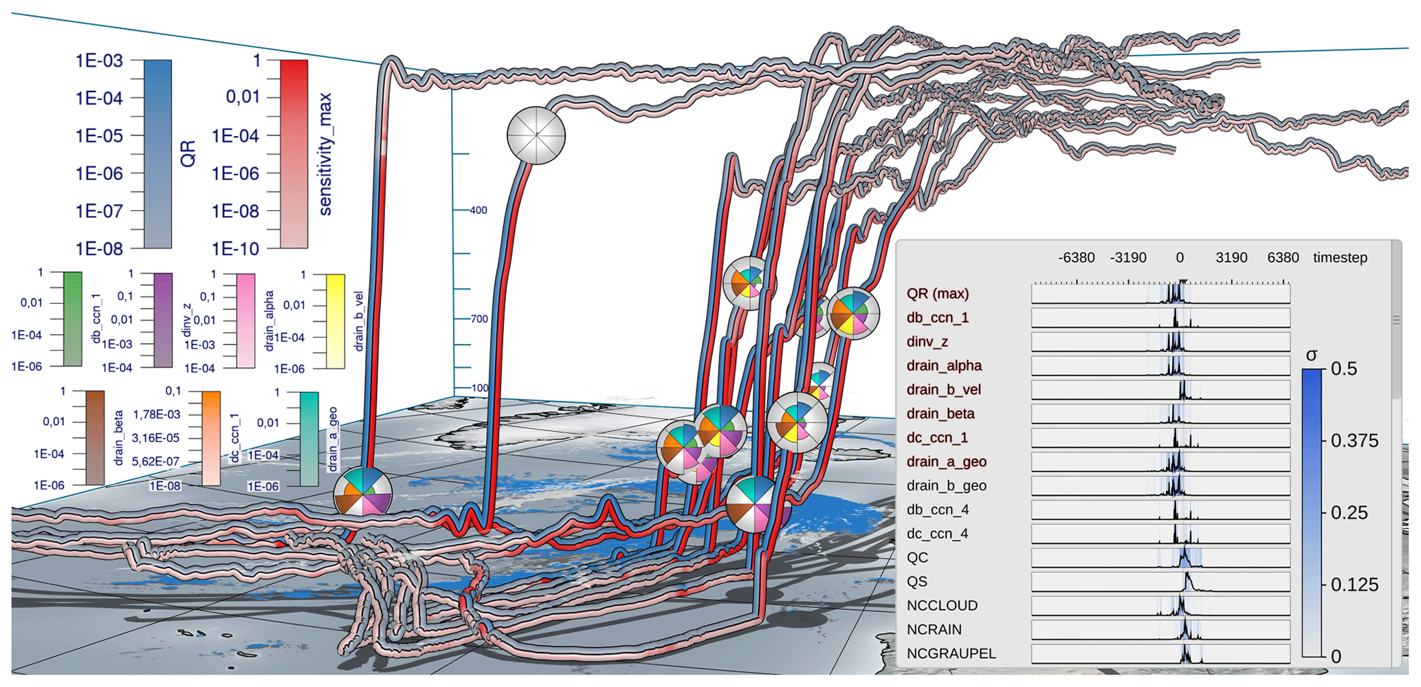
Figure 1Visual analysis of the sensitivity of a prognostic variable to selected model parameters (emphasized in red in curve plot overlay) along warm conveyor belt trajectories in extratropical Cyclone Vladiana to assess uncertainties of parameterizations in numerical weather prediction models. The trajectories are calculated from 20 September 2016 at 00:30 until 22 September 2016 at 08:00. Prognostic variable (blue, rain mass density QR; kg m−3) and maximum simulation parameter sensitivity (red; kg m−3) are color coded along the trajectories in view-aligned bands so that one-half of the seen trajectory tube is consumed by either color. Sensitivity is defined here as the predicted change in QR if the corresponding model parameter is perturbed by 10 %. Multiple sensitivities at a selected time step are visualized via polar charts that are mapped onto spheres in the 3-D view. The radius encodes the quantity at the time step. A consistent view-aligned mapping of sensitivities to polar charts enables an effective comparison across the trajectories. A curve plot shows statistical summaries of prognostic variables, sensitivities and model parameters to which sensitivities are computed. The black lines show the per time step mean value over all trajectories, and the blue shade shows the standard deviation σ. Surface precipitation (kg m−2) is shown on the ground in blue, and the specific cloud liquid water content in the air (kg kg−1) at 860 hPa is shown in white using a horizontal cross section. The display of the earth's surface and shadows places trajectories in spatial context.
Surface precipitation rates in extratropical cyclones can be significantly impacted by convective ascent embedded in WCBs (Oertel et al., 2020, 2021; Jeyaratnam et al., 2020). Moreover, the precipitation formation pathway and associated latent heating are sensitive to the cloud microphysical processes implemented in the numerical model and may in turn introduce uncertainties to WCB ascent (Joos and Forbes, 2016; Mazoyer et al., 2021). As the scale of cloud microphysical processes responsible for precipitation formation is too small to be explicitly resolved in NWP models, parameterizations are used to calculate the integrated effects on the resolved prognostic variables. These parameterization schemes, however, are still associated with large uncertainties that can influence the representation of atmospheric dynamics including air mass ascent and formation of precipitation in NWP models (Leutbecher and Palmer, 2008; Ollinaho et al., 2017; Pickl et al., 2022).
Thorough analysis of the impact of the parameterizations' parameters on prognostic variables can clarify how, when and where model representations of atmospheric processes including air mass ascent and formation of precipitation are particularly sensitive and can yield enhanced process understanding and eventually improved parameterizations. Such an analysis has motivated our work. On the one hand, it requires a methodology to efficiently compute the sensitivities, on the other hand it requires an approach to locate sensitive behavior in space and time and to place it in the context of the simulated atmospheric processes. Regarding the efficient computation of sensitivities, we follow up on recent work by Hieronymus et al. (2022) using algorithmic differentiation (AD), a method to compute derivatives of an implemented model (Griewank and Walther, 2008). In this article, we present a novel method for the visual analysis of sensitive behavior in space and time. We propose an interactive visualization workflow to facilitate
-
automatic identification of relevant sensitivities
-
simultaneous visualization of multiple sensitivities
-
and linking of sensitivities to trajectories in 3-D space.
We note that while the visualization method we are presenting has been motivated by the analysis of sensitivities of WCB trajectories, it can readily also be applied to further analyses of trajectory data that require the simultaneous display and analysis of multiple variables.
Visualization approaches for meteorological analysis have been discussed widely in the literature. Comprehensive overviews have been provided by Rautenhaus et al. (2018), Afzal et al. (2019), and Yoshizumi et al. (2020). Our workflow builds upon and extends approaches to perform interactive statistical data analysis (Love et al., 2005; Potter et al., 2010; Orf et al., 2016; Meyer et al., 2021) and trajectory-based visualization of multivariate data (Stoll et al., 2005; Neuhauser et al., 2022; Russig et al., 2023; He et al., 2019; Nguyen et al., 2019, 2021), and it touches on aspects of 3-D feature-based visualization (Rautenhaus et al., 2015a; Kern et al., 2018, 2019; Bader et al., 2019; Kappe et al., 2022; Bösiger et al., 2022). While in the current work AD is used to compute uncertainty information in the form of parameter sensitivities, previous works in visualization have mostly addressed simulation uncertainty in the form of given simulation ensembles (Sanyal et al., 2010; Wang et al., 2018; Rautenhaus et al., 2018).
In this study, we discuss the use of the proposed workflow for the analysis of WCB trajectories associated with extratropical Cyclone Vladiana, which occurred between 22–25 September 2016 over the North Atlantic (Schäfler et al., 2018). The following analysis questions motivated our work:
-
Do similar trends regarding selected sensitivities and prognostic variables occur across a (sub-)group of selected trajectories? (Q1)
-
Do different sensitivities and prognostic variables show similar statistical characteristics across a selected trajectory group? (Q2)
-
How do sensitivities depend on the time and location along the trajectories, and how are they related to, e.g., precipitation and cloud formation? (Q3)
-
Do coherent sensitivity patterns emerge if trajectories ascending at different times are considered relative to their time of ascent? (Q4)
-
Do sensitivities differ with respect to different types of trajectories (i.e., convective vs. slantwise)? (Q5)
While Q1 to Q3 enable improved process understanding, Q4 and Q5 provide insight into the structure of WCB trajectories and their associated sensitivities. Figure 1 provides a typical visualization of our workflow, which combines standard and novel visualization techniques. For an impression of the interactive aspects, we refer to Videos 1 and 2 in the “Video supplement” (Neuhauser and Hieronymus, 2023), which provide an overview of the implemented visualization techniques (Video 1) and illustrate the analysis of the Vladiana WCB trajectories (Video 2).
The article is structured as follows. We first introduce the employed data and the method's interactive workflow (Sect. 2), before the proposed visualization techniques (Sect. 3) and their technical implementation (Sect. 4) are discussed in detail. In Sect. 5, the visualization techniques are applied to WCB trajectories to illustrate the sensitivity of rain mass density to various microphysical parameters. Section 6 concludes with a summary.
The proposed workflow and methodology facilitate the interactive visual analysis of the effects of simulation model parameters on a selected target variable. In this study, we focus on rain mass density along convective warm conveyor belt trajectories, which are responsible for heavy rainfall on the earth's surface. The analysis hints at relationships between the trajectories' spatial locations and shapes, as well as the occurrence of specific features in the sensitivities of the selected variable to different model parameters.
2.1 Data
We consider WCB trajectories that are computed for extratropical Cyclone Vladiana, which developed from 22–25 September 2016 in the North Atlantic during the North Atlantic Waveguide and Downstream Impact Experiment field campaign (Schäfler et al., 2018). The trajectory data of the case study shown here are taken from a simulation described in detail by Oertel et al. (2020) with the NWP model COSMO version 5.1 (Baldauf et al., 2011). In addition, an online trajectory scheme (Miltenberger et al., 2013) was applied to calculate the positions and properties of the trajectories from the resolved 3-D wind field at every model time step, here 20 s. The trajectories are calculated from 20 September 2016 at midnight until 24 September 2016 at 16:00 (all times are given in UTC). Different trajectories are started every 2 h until 22 September 2016 at 16:00. The starting time for the trajectories from Sect. 5 covers the same range. The other trajectories showcasing different visual analysis methods start on 20 September 2016 at 00:30 and are calculated until 22 September 2016 at 08:00.
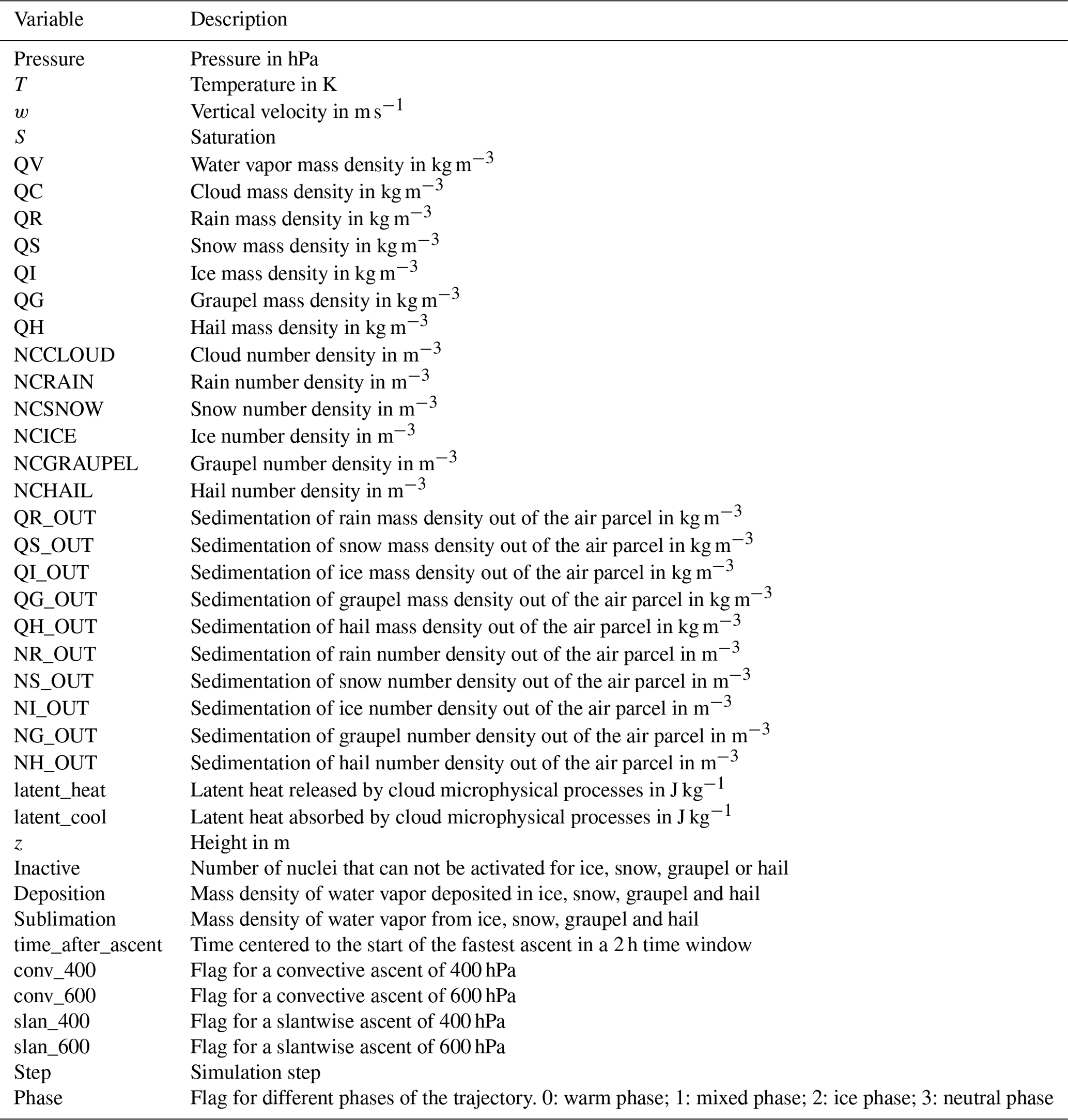
In this work, sensitivity is defined as the linearly predicted change in a prognostic variable if a model parameter is perturbed by 10 % (Hieronymus et al., 2022). The prognostic variable can be any of the NWP simulation outputs. In this work, we focus on multiparameter sensitivities of rain mass density (QR). The linear prediction is the gradient computed via AD times 10 % of the model parameter value. AD can be used to quantify the impact of multiple model parameters on a prognostic variable at once. It exploits the fact that any computer model after code compilation becomes a sequence of differentiable elemental operations. By repeatedly applying the chain rule, the derivative for any code can be calculated automatically alongside the usual run of the code. AD has been applied on a warm-rain microphysics scheme for idealized trajectories (Baumgartner et al., 2019) and recently on convective and slantwise WCB trajectories (Hieronymus et al., 2022). The application of AD to a prognostic variable along WCB trajectories results in one sensitivity value of this variable for each model parameter and for each simulation point along the trajectories. In an NWP model with multiple processes and hundreds of parameters, AD also reveals which processes are active. That is to say that if the sensitivity to a parameter is above zero, then the simulation must have involved the corresponding process.
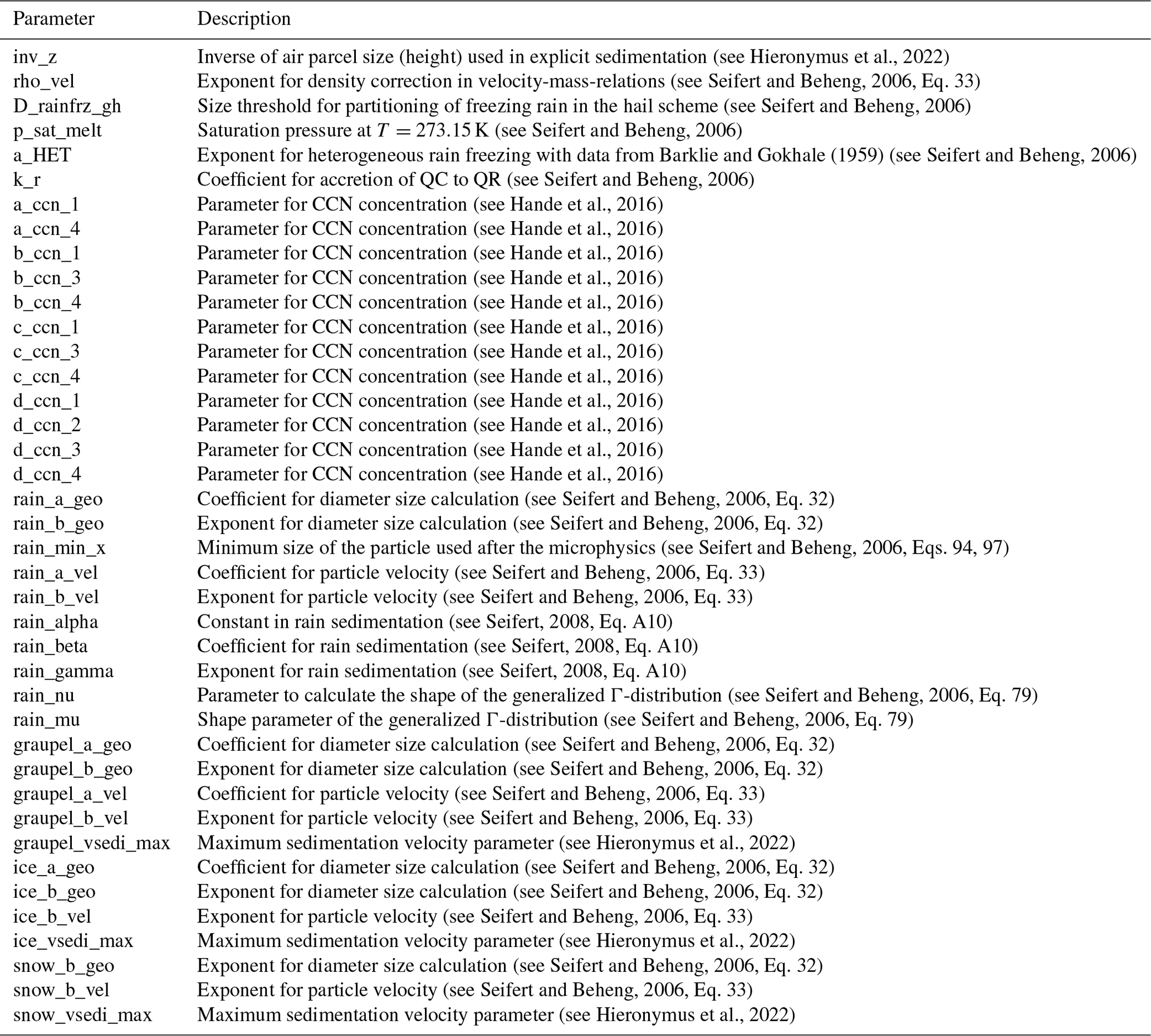
AD has been applied to convective and slantwise trajectories in Vladiana with the tool by Hieronymus et al. (2022), which implements the Seifert and Beheng (2006) two-moment cloud microphysics model. The tool includes routines for the ice phase (Kärcher et al., 2006; Phillips et al., 2008) and is augmented with CoDiPack (Sagebaum et al., 2019) to evaluate the Jacobian of the implemented model at every time step in an efficient way. Overall, the sensitivities of rain mass density with respect to 177 model parameters have been computed via AD, of which the 40 most important parameters are used in this work. For an overview over all available parameters and prognostic variables, please refer to Appendix C.
2.2 Method overview
Figure 2 shows an overview of the method's workflow. The input is a set of M convective WCB trajectories – , – which have been computed over a time interval of interest, as well as a set of L attributes – , – containing model parameter sensitivities along these trajectories with respect to a selected prognostic variable (Fig. 2b). Sensitivities are named “d[…]”, which stands for , where rain mass density (QR; kg m−3) is the selected target variable, and “[…]” is the model parameter in question. “sensitivity_max” is the per time maximum of all sensitivities.
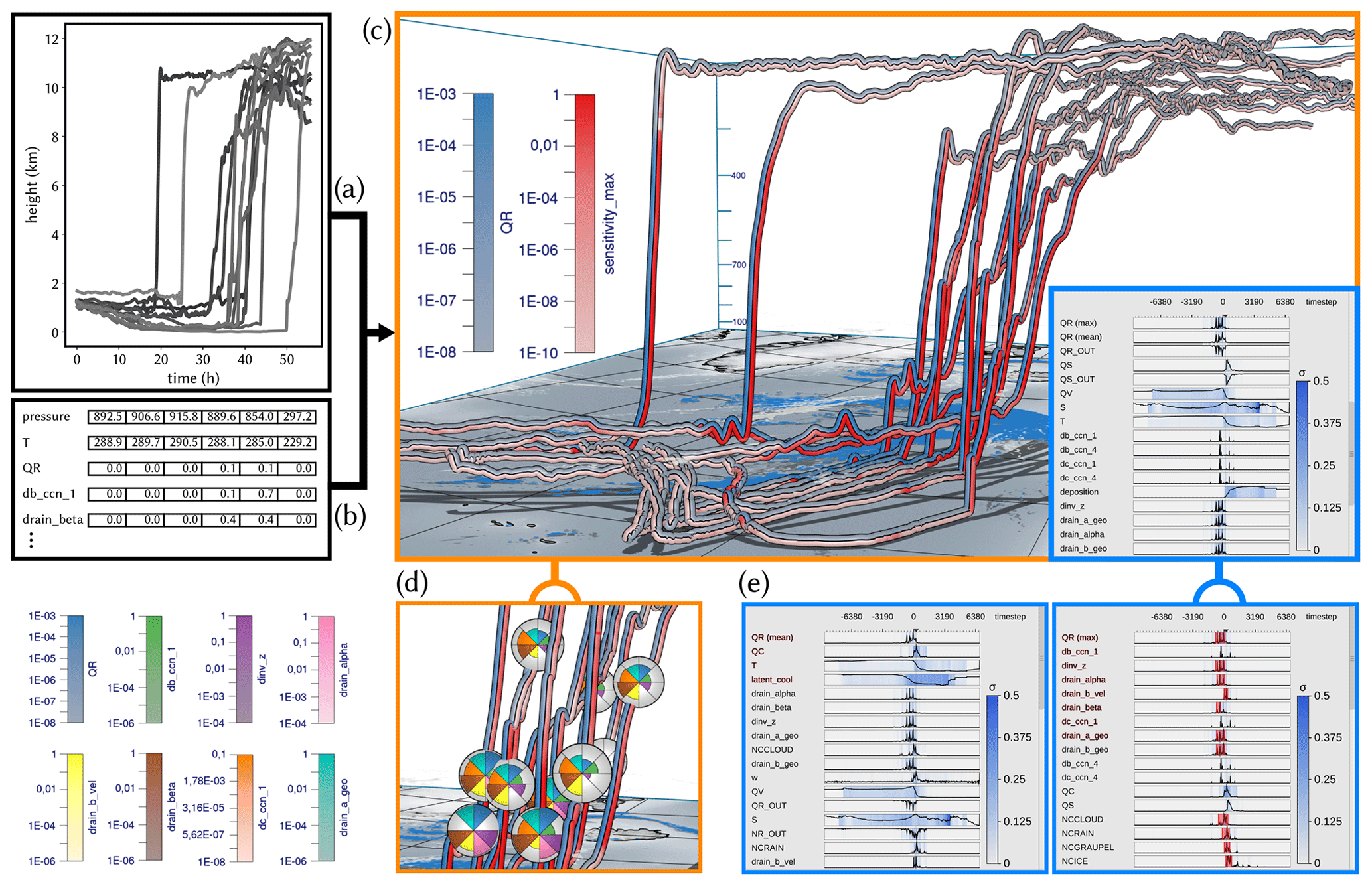
Figure 2Workflow overview: Met.3D reads (a) 3-D trajectory data and (b) tables of model variables and sensitivities along the trajectories. (c) The visualization canvas of Met.3D, including the 3-D trajectory view that is linked to the curve plots' summary view. (d) Focus view options using sphere-based multiparameter visualization via polar area charts. (e) Statistical summaries of the temporal development of variables and sensitivities, which can be ordered automatically regarding the similarity of their temporal development to a selected variable or sensitivity. (f) Variables exhibiting a selected sequence of events can be determined automatically and shown first.
As shown in Figs. 1 and 2e, we use an interactive multiparameter “curve plot” (2-D line plot) to enable the user to analyze the time evolution of the maximum of any selected sensitivity (as well as the standard deviation (SD) of this maximum) over all trajectories. Beyond this, sensitivities can be sorted automatically with respect to their temporal development by using the development of a selected sensitivity as reference. The user can then select a time period in the curve plot of a sensitivity or prognostic variable and let the system search for similar trends in the temporal developments of other sensitivities or prognostic variables. The curve plot view enables an interactive comparative visualization of the statistical similarities of local and global temporal trends across the set of selected trajectories.
Curve plots alone, however, cannot reveal the relationships between sensitivities and the trajectories' locations and shapes. Therefore, the curve plots are embedded into the open-source meteorological 3-D visualization system Met.3D (Rautenhaus et al., 2015b). Met.3D visualizes the trajectories in their spatial context (i.e., the 3-D trajectory view), including visualizations of additional data sources like textured terrain fields and in particular 3-D atmospheric field data. From its existing support to display a single parameter along 3-D trajectories (Rautenhaus et al., 2015a), Met.3D has been extended according to the specific visualization options required to support a comparative analysis as mentioned. Multiple sensitivities along a trajectory can now be shown via stripe patterns with different colors (Neuhauser et al., 2022) and by using additional geometric primitives like enlarged disks (Sadlo et al., 2006).
The curve plot view is linked to the trajectory view in that the user can move a vertical line along the time axis, and instantly the points on each trajectory corresponding to that time are highlighted by enlarged disks (sphere glyphs), which encode multiple sensitivities simultaneously and enable a comparison of sensitivities across trajectories (see Video 1, 2 min 46 s; Neuhauser and Hieronymus, 2023). Alternatively to moving the time line in the curve plot, the user can pick a sphere glyph and move it along the trajectory (see Video 1, 3 min 18 s; Neuhauser and Hieronymus, 2023). All other glyphs are moved accordingly in time so that via animation the sensitivities on different trajectories can be compared.
Striped bands become problematic when the bands are fixed to a bending trajectory's surface, where they appear distorted and can cover differently sized regions in the view plane (see Fig. 6a). Similarly, enlarged disks suffer from occlusions under certain views, and disks may penetrate each other when the trajectory exhibits strong bending. To address these limitations, we use view-aligned bands (Russig et al., 2023) that consistently segment the visible surface part into equally sized and connected stripes. By further letting the system automatically compute for each trajectory its unique time of ascent and interpreting the current time relative to these times, the trajectories' sensitivities during the ascend phases can be effectively compared.
As soon as more than two to three sensitivities are visualized simultaneously, however, the single bands become too thin and can hardly be distinguished in the 3-D view. Therefore, we restrict this by showing only the temporal evolution of the target variable and the maximum sensitivity over all parameters via colored bands and propose a view-aligned circular mapping for showing multiple sensitivities at a selected time step simultaneously. Multiple sensitivities are encoded via a polar area chart that has a fixed orientation in view space and is mapped onto a sphere centered at a trajectory point. The enlarged sphere acts both as a time step marker and magnifying lens. Since polar charts on different trajectories are consistently oriented in view space, the sensitivities can be compared effectively in a single view. The number of subdivisions of the polar chart is given by the number of sensitivities the user selects in the curve plot view.
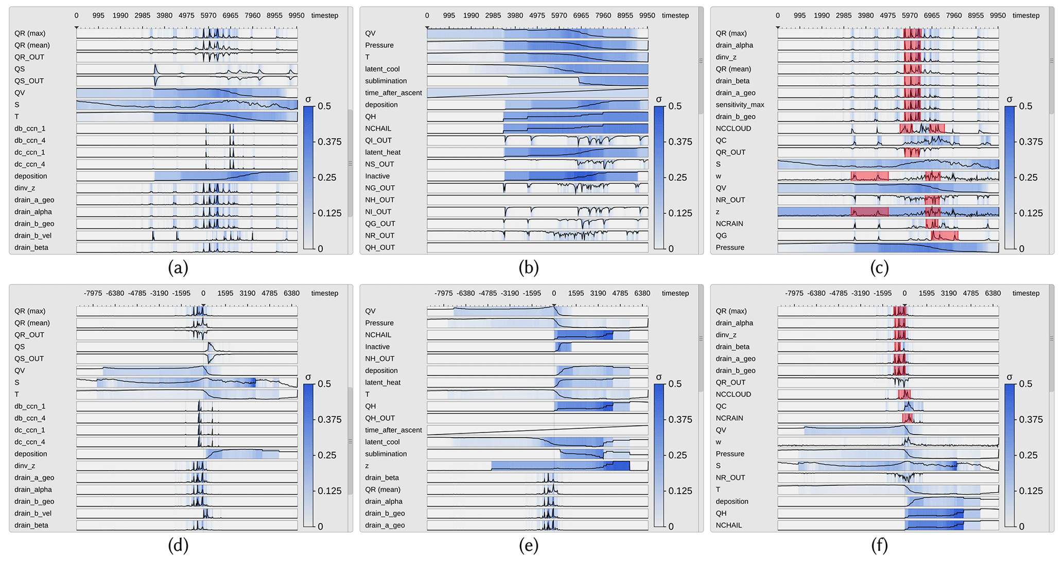
Figure 3Curve plots with trajectories aligned by time step (a, b, c) and time of ascent (d, e, f). Curve plots show the mean of prognostic variables and the maximum of sensitivities over all trajectories. The SD to the mean and/or maximum is mapped by color. Top curve shows target variable rain mass density (QR). (a, d) Curve plots in random order. (b, e) Curve plots are sorted regarding the similarity of their time development relative to the target variable QV (water vapor mass density). (c, f) Sorting regarding similarity to max QR. A pattern of consecutive spikes has been selected in QR, and regions in which similar features have been determined are highlighted.
The visual analysis workflow presented in this work builds upon the curve plot view, the 3-D trajectory view and interactive linkage between these two views. Linkage enables us to find relationships between locations with high sensitivities along trajectories and the trajectories' locations and shapes.
3.1 Multiparameter curve plot view
The curve plot view shows the single curve plots of the prognostic variables and sensitivities vertically aligned (see Fig. 3). The time axis is going to the right, and the vertical axis represents the value domain. All values are initially normalized to [0,1]. The trajectories are traced with a time step of Δt=20 s, which is also the time delta between two data points on the horizontal axis. When the number of time steps exceeds the number of pixels reserved for showing the curve plots, the algorithm “largest triangle three buckets” (LTTB) (Steinarsson, 2013) is used to recursively downsample the data. LTTB takes into account the perceptual importance of points during the downsampling process by assessing the area of triangles formed by points in neighboring buckets. By generating the curve plots at multiple resolutions, the user can zoom into interesting time intervals and analyze the variables and sensitivities over these intervals in more detail. In this way, the performance penalty of drawing too many points can be avoided, simultaneously ensuring that no features are lost. In our tests, the frame time for rendering the curve plot view was almost proportional to the number of points rendered. Using LTTB makes the frame time independent of the number of time steps of the underlying data, as the number of buckets is based only on the width of the curve plot view on the screen. In our tests, we have noticed an up to 25× performance improvement with LTTB for our test data.
For the target variable and sensitivities, in each band the maximum over all trajectories is shown via a curve. For all other prognostic variables and model parameters the mean over all trajectories is shown. Since the sensitivities are often close to zero, resulting in very small mean values, the maximum values and corresponding SD can far more effectively indicate the spread of the distributions and the overall trend regarding their strengths. In particular, regions of potential local instability are emphasized, and high sensitivities are not missed. The background is colored according to the SD with respect to the values represented by the curves; i.e., SD is mapped to a color ranging from white (low value) to blue (high value). By utilizing mouse controls, the user can scroll through the set of parameters and zoom into individual regions in the curve plot view. A moveable vertical line indicates the currently selected time step.
Since there are many parameters and not all can be shown in one single view, the system proposes an automatic ordering to quickly identify sets of parameters with a similar sensitivity development over time. Therefore, the user selects an individual curve plot, and the system sorts all curve plots in descending order regarding the similarity to the curve in this plot. As a measure of similarity we use the absolute normalized cross-correlation:
Here, Xi and Yi are two time series, and μx and μy and σx and σy are the corresponding means and SD. Note that due to the division by the SD, NCC becomes independent of the scale of the two time series.
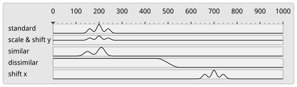
Figure 4Test sequences sorted by their similarity to “standard” using the absolute NCC. The NCC can deal with scaling and shifting in the data axis but not with shifting in the time axis. We address this limitation by aligning curves relative to the time of ascent of the corresponding WCB trajectories.
We further considered CrossMatch (Toyoda and Sakurai, 2013) and the “edit distance on real sequence” (EDR) (Chen et al., 2005) as alternatives for similarity sorting. However, since the former does not support data normalization, and the latter may suppress relevant sensitivities due to built-in noise suppression, both turned out to be less effective in our scenario.
Figure 3a and d and Figure 3b and e show, respectively, the initial curve plots using a random ordering of variables and the ordering with respect to the selected temporal distribution of the variable QV (water vapor mass density). Figure 3c and f show the ordering with respect to QR. As can be seen, a number of sensitivities behave very similarly to QR and, in particular, show a significant change at the point in time where QR changes significantly. Note here that by using the absolute value of the NCC, it is ensured that parameters with high negative correlation are shown before those with low absolute correlation.
A limitation of NCC is that time series which show a similar but time-shifted behavior are found to be dissimilar (see Fig. 4). Even though this can be avoided by computing NCC for successively delayed versions of the original series and finding the peak in the sequence of similarities, we provide a different alternative that takes into account that it is in particular the ascent phase of a trajectory which is of interest. We define the start of the ascent of a trajectory as the start of the most rapid ascent within a 2 h window. This is calculated by using a sliding window of 2 h and calculating the total ascent within this time window. Finally, the trajectories are shifted in time so that they all start their ascent at the same time, and the shifted versions are then sorted via NCC.
To facilitate an improved comparative analysis of the sensitivities along multiple trajectories, it is furthermore important to find similar reoccurring subsequences in these data. In particular, since trajectories are seeded at different locations and times, they can first travel close to the surface over different time intervals, before similar upstream paths are observed along which specific sensitivity patterns occur. To determine similar patterns, the user can select a time interval using the mouse, and automatically the subsequence of sensitivity values within this interval is searched in the same and all other curves via the subsequence matching algorithm SPRING (Sakurai et al., 2007). SPRING selects all subsequences with a dynamic time warping (DTW) distance less than a user-controlled threshold by warping one sequence so that it best matches another sequence (see Fig. 5 for a schematic illustration). The DTW distance is the sum of the per-element distances of two such optimally aligned sequences. When searching for all subsequences in a sequence of length n with respect to a query sequence of length m with a DTW distance less than a user-specified threshold, a naive algorithm has a time complexity of O(n3m). Due to its time complexity of O(nm), SPRING enables an interactive use even for long sequences.
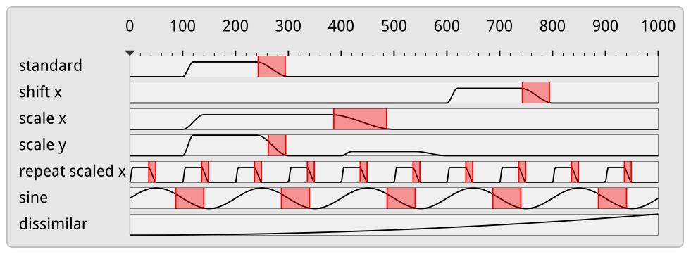
Figure 5Subsequence matching in the curve plot view using SPRING. SPRING, due to dynamic time warping, can pick up patterns that are shifted and scaled in the time axis.
As SPRING is based on dynamic time warping, the timescale of subsequences may be both stretched or compressed. As can be seen in Fig. 3c and f, this enables us to select, e.g., all falling edges in the temporal developments, independently of their duration. The subsequences found are underlined by red background color. Compared to NSPRING (Gong et al., 2014), an extension of SPRING that adds support for data normalization, in all of our experiments SPRING gave the most plausible results in line with our perception of similarity (i.e., that the similarity of two sub-sequences is also dependent on their scale).
The number of sensitivities that can be read by the system is not limited, yet beyond a certain number the corresponding curve plots cannot be shown simultaneously and the user needs to scroll through them. Especially in this case the functionality to quickly identify interesting sensitivities through similarity sorting and subsequence matching is beneficial. An alternative to using scroll bars is using table lenses (Rao and Card, 1994), which reduce the height of data rows not currently in focus. This visual representation is, however, not well-suited to the curve plots used in the paper, as the vertical height of the individual rows is used to encode the magnitude of the data points, which cannot be reduced arbitrarily.
3.2 Trajectory view
In the trajectory view, the trajectories are shown in their geospatial context using Met.3D (see Fig. 2). Each trajectory is rendered as a colored and illuminated tube with black outlines to let it stand out against the background. By default, the target variable and the maximum sensitivity are encoded by two different colors, and they are shown on the tube via two bands running along the direction of the trajectory's tangent (see Fig. 6a, b for an illustration).
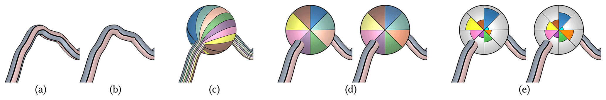
Figure 6Target variable (bluish color map) and maximum sensitivity (reddish color map) are mapped to the trajectory surface via (a) object space bands and (b) view-aligned color bands. (c) When multiple variables are mapped to view-aligned bands running across an enlarged focus sphere, the band's distortions and alignment with the trajectory's tangent prohibit an effective visual analysis and comparison between different trajectories. (d) The use of consistent view-aligned polar color charts improves readability of multiple variables and enables an effective comparison between different trajectories. While in (d) values are encoded by saturation, in (e) a polar chart using the radius instead of the saturation for encoding the individual values is used.
However, when defining these bands in object space (i.e., the assignment of points on the tube surface to either band is fixed; see Fig. 6a), parts of a band can disappear and become visible on the opposite surface part when rotating around the trajectory or when the tube twists. This makes it difficult to match a band with its corresponding quantity, and it is especially critical when multiple trajectories are shown and need to be compared regarding the data that are shown in the bands. To avoid this problem, we have developed a rendering technique that renders the bands so that each band covers always one-half of the visible tube surface regardless of the current view and the tube's orientation (see Fig. 6b). This rendering is used in all trajectory views throughout this work.
While in principle it is possible to show more than two bands on each trajectory, quickly with increasing view-distance the bands cannot be distinguished anymore. To circumvent this restriction, we propose a focus view that utilizes a locally enlarged surface to provide more space for the variables shown. On each trajectory, a sphere with adjustable radius is rendered at the currently selected time. The sphere acts both as a time marker and a magnifying lens enabling the display of more variables at once. By showing one focus sphere on each trajectory at the selected time, occlusions that are introduced when increasing the radii of the trajectories everywhere can be minimized.
The magnifying lens can in principle be realized by centering a sphere at a selected point on a trajectory and letting multiple bands run across it (see Fig. 6c). When crossing over the sphere, the bands become wider so that the different colors can be better perceived and distinguished. As for bands on a tube, bands on a sphere can be made view-aligned; i.e., while they are oriented according to the trajectory tangent, they cover equal area on the visible sphere surface. Even though this mapping results in a fairly smooth appearance, the following drawbacks can be perceived. Firstly, an additional yet unwanted shape cue is introduced because the bands deform differently on the sphere surface. Secondly, due to the shading of the sphere surface, the bands' colors become brighter and darker depending on where the bands cross over the surface. Thus, the relationships between colors and values are disturbed. Thirdly, and most importantly, even when a variable shown on two different trajectories has the same value, the band patterns can look vastly different if the trajectories have different orientations in 3-D space. This makes a visual comparison of the variables between different trajectories difficult. Due to these reasons, we refrain from using this visual mapping.
3.3 Polar charts
In the following we propose an alternative mapping that does not use bands and avoids an alignment with the trajectory. The mapping builds upon a polar-chart-based subdivision of the sphere; i.e., the visible surface part is split into equal angle sectors. Each sector can be given either equal area and a color that is saturated according to a given value (see Fig. 6d) or a constant color and a modified radius to indicate the value (see Fig. 6e). In either case, the user selects the variables to be shown, and the polar chart is automatically subdivided into an equal number of sectors. The polar charts are aligned with the up axis of the camera system to make them view-aligned (see Sect. 4). This enables a more efficient and effective comparison of charts on multiple trajectories.
For coloring N sectors, N best distinguishable colors are chosen from the Brewer color map (Harrower and Brewer, 2003). By default, we offer users the eight-class “set1” (https://colorbrewer2.org/#type=qualitative&scheme=Set1&n=8, last access: 9 August 2023) qualitative color map plus turquoise. When values are mapped to saturation, the value range is mapped from 20 % saturation to full saturation. This prevents adjacent sectors with low values from fading out to almost indistinguishable colors. Since each sector of a polar chart is equally affected by shading, the use of shading is less problematic than for bands. Furthermore, each view-aligned chart has a consistent orientation.
The mapping using color saturation gives maximum space to each variable in a chart. On the other hand, an accurate visual reconstruction of values based on saturation can be difficult and, in particular, makes the comparison of values in the same sector but in charts on different trajectories less effective. According to Munzner (2014) and based on experiments from psychophysics (Stevens, 1975), visual channels like length or area rank higher regarding the accuracy than color saturation. Based on these findings, we alternatively use constant colors per sector but select the radius of the sector from the center depending on the magnitude of the associated value. We choose a greyish chart background color which is not used by any sector and furthermore draw thin contour lines around each sector. As can be seen in Fig. 6, the area encoding of variables can be perceived more effectively than the saturation encoding, yet when charts are more distant from the viewer, some sectors might become too small and cannot be perceived. Due to this reason, we provide polar charts with radius variation as the default visualization mapping and allow the user to manually switch to saturation encoding.
3.4 Predicate-based filtering
As described above, color mapping is used along the trajectories to encode individual sensitivities. By using saturation to encode the strength of a sensitivity, the user can quickly locate regions along the trajectories where two selected sensitivities are high. When two sensitivities are shown, however, it is difficult to efficiently spot regions where, for instance, two sensitivities are simultaneously high or one of them is high while another one is low. This requires a search task with explicit attention to the variation in colors in the bands along the trajectory. To support the user in such tasks, predicates regarding the values of sensitivities can be specified and used to filter out regions along the trajectories where the values do not satisfy these predicates. In particular, the user can specify value ranges for both sensitivities shown, and the system automatically desaturates all locations where the values are not within the selected ranges. In Fig. 7, interval-based filtering is demonstrated. It can be seen that locations where the predicates are fulfilled stand out from those locations where desaturation has been applied, enabling an efficient and effective location of selected value intervals.
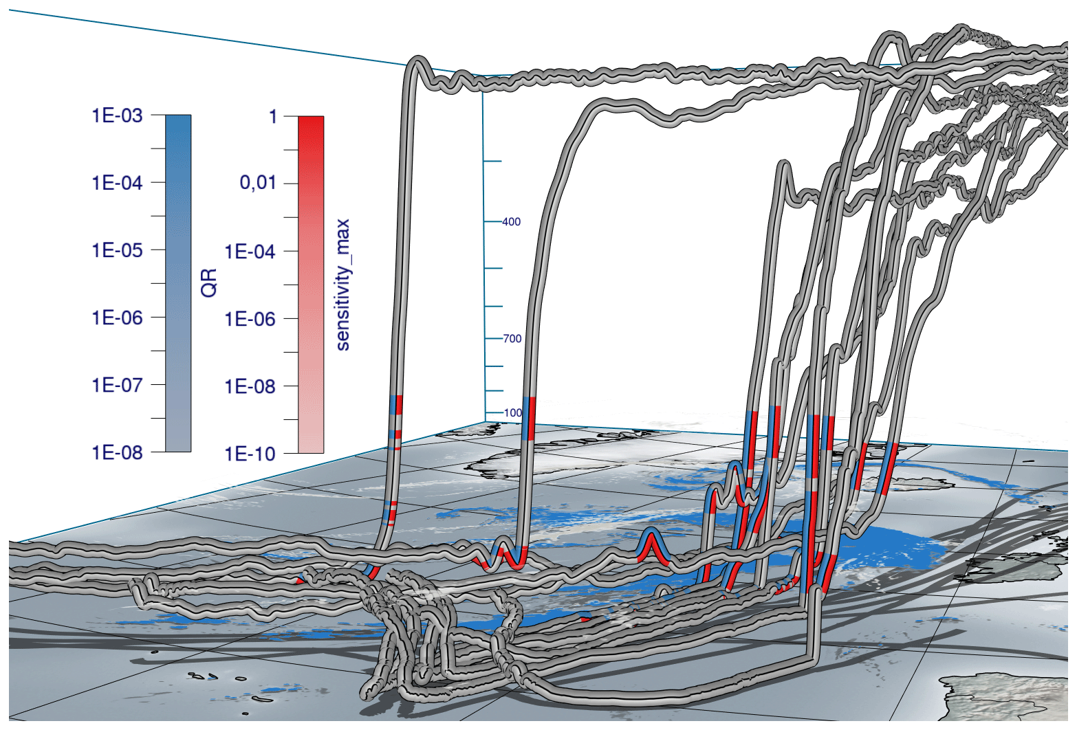
Figure 7Data from Fig. 1 with predicate-based filtering where regions are highlighted where QR and dinv_z ≥0.1.
To further aid users in reading individual values from the trajectories and polar charts, a mouse hover is supported to inspect the values of the quantities below the mouse cursor. The use of this mouse hover is demonstrated in Video 1 (4 min 56 s; Neuhauser and Hieronymus, 2023). In order to avoid clutter and visual overload due to a high number of trajectories displayed simultaneously, we support deselecting individual trajectories with the mouse. These trajectories are then desaturated in the 3-D view. Also, it is left up to the users to optionally use discrete, quantized color maps instead of the continuous color maps used in the figures of this work.
All techniques presented in this paper have been integrated into Met.3D, which uses the OpenGL application programming interface (API) for GPU-based rendering. For drawing the curve plot view, the vector graphics library NanoVG (https://github.com/memononen/nanovg, last access: 9 August 2023) is embedded. It provides hardware-accelerated rendering of vector graphics elements like anti-aliased lines and polygons, as well as the specification of scissor geometry, to restrict rendering to a rectangular screen region. This is necessary for providing a scroll bar for the content of the curve plot view.
Met.3D offers functionality to render 3-D trajectories using illuminated polygonal tubes, including a base map showing the earth's surface and shadows cast by the trajectories. However, the specific rendering options required by our approach, i.e., showing view-aligned bands on trajectories and spheres, as well as view-aligned polar charts on spheres, are not available. Notably, these options cannot be realized using object-space texture mapping or standard pixel shaders due to the requirement to keep the color patterns fixed in screen space.
A detailed description of our implementation is given in Appendix A and Appendix B. In the following, we outline the basic concepts underlying the implementation, including additional rendering options.
4.1 View-aligned bands
For rendering the trajectories, what needs to be determined for each fragment that is rendered for the tube surface is which of the N bands in screen space it belongs to. Each fragment lies on a circular arc orthogonal to the trajectory tangent (see Fig. 8). The bands run perpendicularly to this arc along the tangent direction of the trajectory. In order for the bands to have equal thickness, the angle along the arc to the fragment position is projected onto a line perpendicular to the tangent, which removes the curvature of the arc from the individual bands. The projected arc is then subdivided into N sectors which all have the same height in screen space, and the fragment is classified according to the sectors by computing its relative position dband in the projection and assigning the corresponding variable index ivar to it. All required parameters can be derived solely from local properties of the rendered surface, i.e., the surface normal vector n, the trajectory tangent vector t and the camera view vector v. In particular, by projecting the camera view direction into the plane orthogonal to the trajectory's tangent direction, the problem of computing the circular arc and the angle it subtends can be reduced to a 2-D problem (see Appendix A).
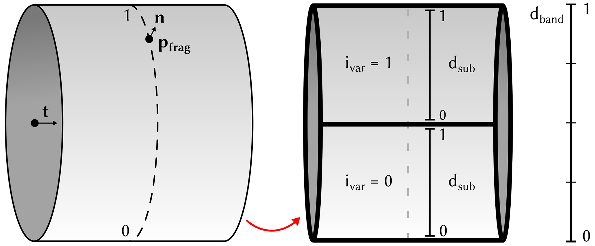
Figure 8Illustration of local surface properties and subdivision of the visible part of a trajectory to determine a fragment's band position dband, the sub-band position dsub and its corresponding variable ID ivar.
4.2 View-aligned polar charts
To color a sphere with a polar chart that encodes the values of multiple parameters into its sectors, the screen space projection of the sphere is subdivided into a predefined number of individual sectors. To achieve a consistent assignment of parameters to sectors for all spheres, first the angle αsector representing the angular distance of a fragment pfrag to the up axis of the camera is computed. The global sector position dsector is then given by
When mapping N parameters onto the sphere, the sector position is subdivided into multiple subsector positions dsub.
WCB trajectories associated with extratropical Cyclone Vladiana ascend in a wide region near the cyclones' fronts between 23 September 2016 and 26 September 2016 (Oertel et al., 2019, 2020), where WCB ascent leads to substantial surface precipitation (Fig. 9). A 3-D view on the trajectories' ascent in the vicinity of Vladiana's fronts has recently been provided by Beckert et al. (2023). Here, we demonstrate the value of our new visual analysis method by discussing first investigations of the sensitivity of the rain mass density (QR) to microphysical parameters along WCB trajectories within Vladiana. We add the prefix “d” (for “derivative”) to parameter names to refer to the sensitivity of QR to the parameter. For the example presented here, we are interested in the comparison of sensitivities related to QR (i) along trajectories in different regions of the cyclone and (ii) for WCB trajectories with different ascent behavior; i.e., we are particularly interested in the spatial variability in sensitivities and their relation to the WCB ascent rate. The interactive aspects of the analysis are documented in Video 2 (Neuhauser and Hieronymus, 2023).
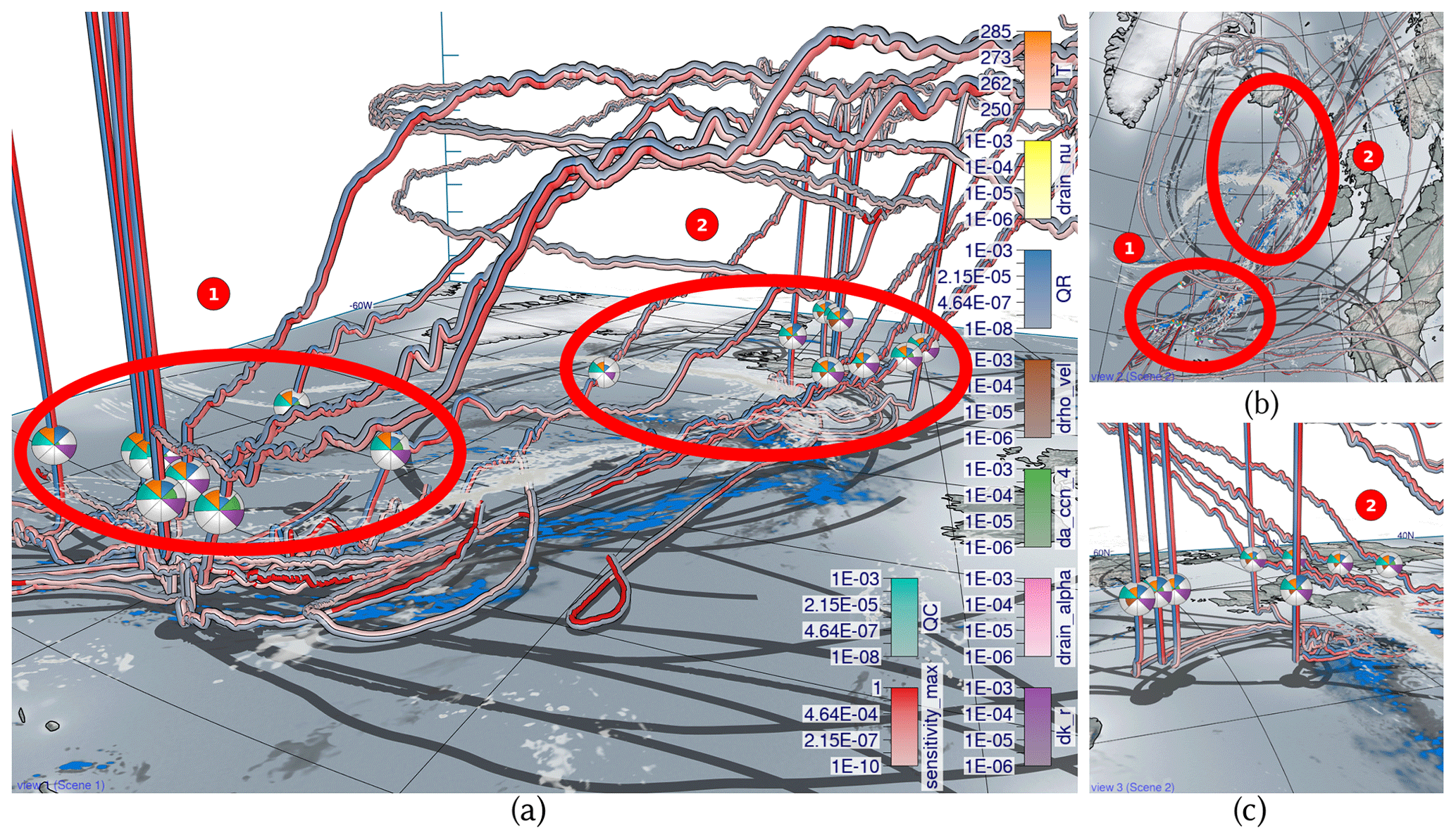
Figure 9Overview of selected trajectories and first insights with spheres at the same height. Low-level clouds at approximately 1500 m altitude (gray) and surface precipitation (blue) are shown at 07:00 UTC on 23 September 2016 when multiple trajectories start their ascent. (a) Trajectories ascending in the south (group 1) and in the north (group 2) with spheres showing eight variables each. (b) View from the top with the northern group 2 near clouds and precipitation and the southern group 1 with less clouds and precipitation. (c) A close-up view of group 2.
We focus on selected subsets of trajectories to analyze the joint development of multiple sensitivity parameters. To pre-select different groups of trajectories, the 8744 available WCB trajectories have been clustered with k-means into different groups (see Fig. 9). We use the location and ascent rate of WCB trajectories as distinction criteria for the clustering to analyze the spatial dependencies of parameter sensitivities (Q3) and the characteristics for different types of trajectories (Q5). No weights have been applied to the clustering. From the clusters, we further select five trajectories with the slowest and five with the fastest ascents in the north and south, respectively.
Figure 9 and Video 2 (44 s; Neuhauser and Hieronymus, 2023) illustrate the substantially different ascent behavior of the fast compared to the slowly ascending WCB trajectories and simultaneously show that QR is primarily important during the ascent of WCB air parcels. In the following, we analyze the sensitivity of QR to microphysical parameters and compare the multiparameter sensitivities (i) in trajectories ascending in the north and south and (ii) across fast and slow trajectories.
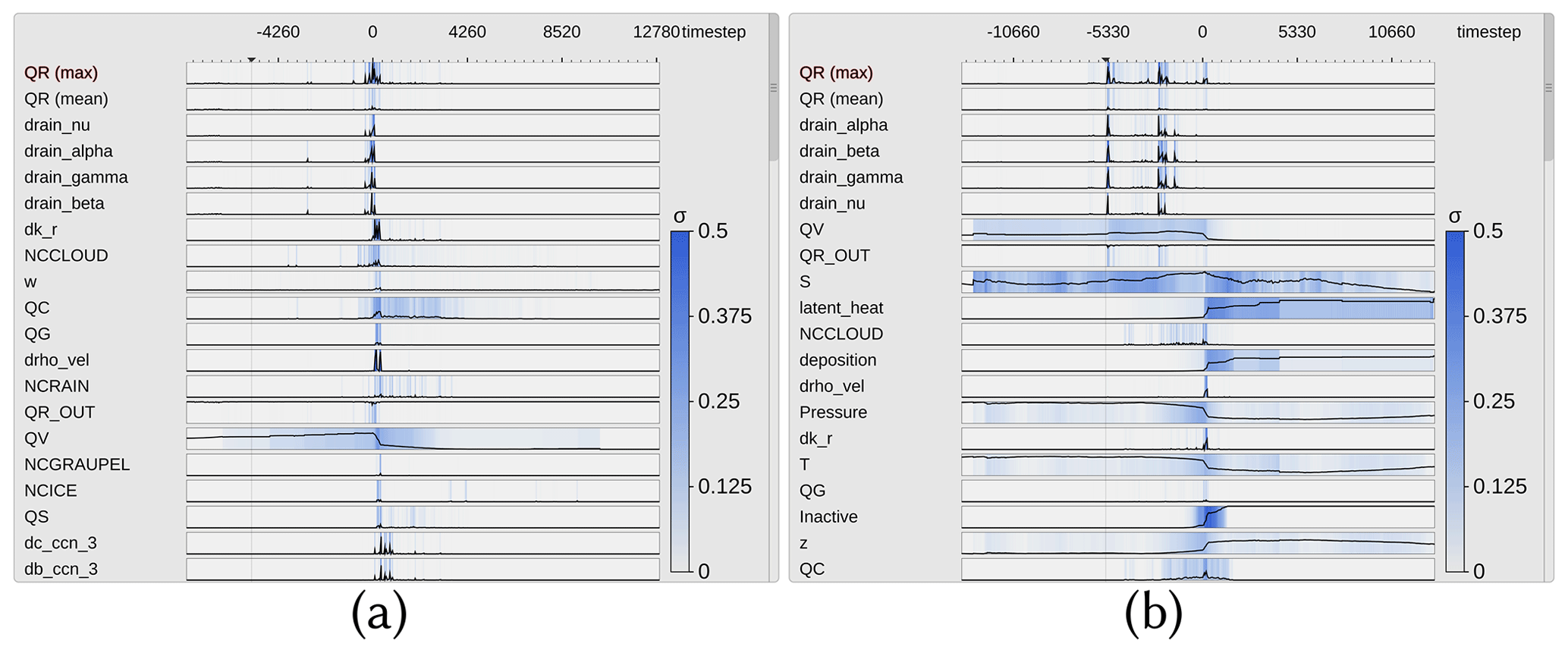
Figure 10Curve plots aligned by time of ascent. The labels for the x axis show the simulation time step, where each simulation step stands for 20 s. (a) Only trajectories from the southern group have been selected. There are large peaks for rain mass density (QR) around the start of the ascent, which coincide in part with peaks in the collision parameter dk_r. This indicates rain formation from the ascent of colliding cloud droplets. (b) Trajectories from the northern group with a peak in QR several hours before their ascent starts. Those rain droplets stem from precipitation above the trajectories.
5.1 Spatial variability in parameter sensitivities
Figure 10 shows curve plots with trajectories selected from either the southern (Fig. 10a) or northern (Fig. 10b) group to analyze and compare trends of parameters across one or more groups of trajectories (Q1, Q2 and Q3). We select QR as the target variable and center the x axis by the time of rapid ascent of each trajectory to understand if coherent sensitivity patterns of QR emerge once trajectories are centered relative to their time of ascent (Q4). The variance of the sensitivities (blue shades) is similarly distributed for both groups, but peaks appear at different times. The southern group shows QR maxima at the start of the ascent, while the northern group is characterized by larger QR maxima a few hours before the ascent starts. From this, we can infer that the variance between trajectories with different locations of ascent is higher than between trajectories with a similar location. Such high QR along trajectories can arise from either (i) sedimentation of rain from above (influenced by parameters alpha, beta and gamma in the numerical model's parameterization) or (ii) local production of raindrops from the collision of available cloud droplets (influenced by the cloud condensation nuclei (CCN), the mass density of cloud droplets (QC) and a cloud collision parameter (k_r); for a detailed description of these parameters, see Seifert and Beheng, 2006, and Hieronymus et al., 2022). Hence, we are interested in which processes are relevant and which are dominant in which region. The automated ordering (Sect. 3.1) of the parameters provides further insight (see Video 2, 3 min 3 s; Neuhauser and Hieronymus, 2023). The parameters are sorted by similarity in each time step to the maximum of QR. The sensitivities of QR to the parameters rain_alpha, rain_beta, rain_gamma (used for sedimentation velocity) and rain_nu (used in the description of the size distribution of raindrops) are the variables with the highest similarity to QR in both cases.
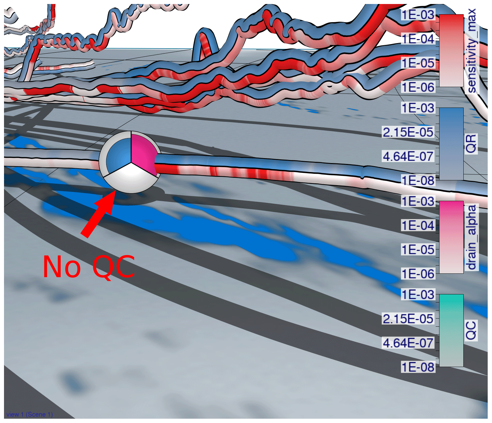
Figure 11View-aligned polar chart for a selected trajectory in the lower troposphere. The sensitivity of rain mass density (QR) to the sedimentation parameter rain_alpha (pink) is more pronounced where large amounts of rain mass (blue) appear and where rainfall is high (blue shade on the ground). The maximum sensitivity (red) here stems from the sensitivity of QR to the parameter rain_alpha. Even though QR is large, no cloud droplets are present (turquoise).
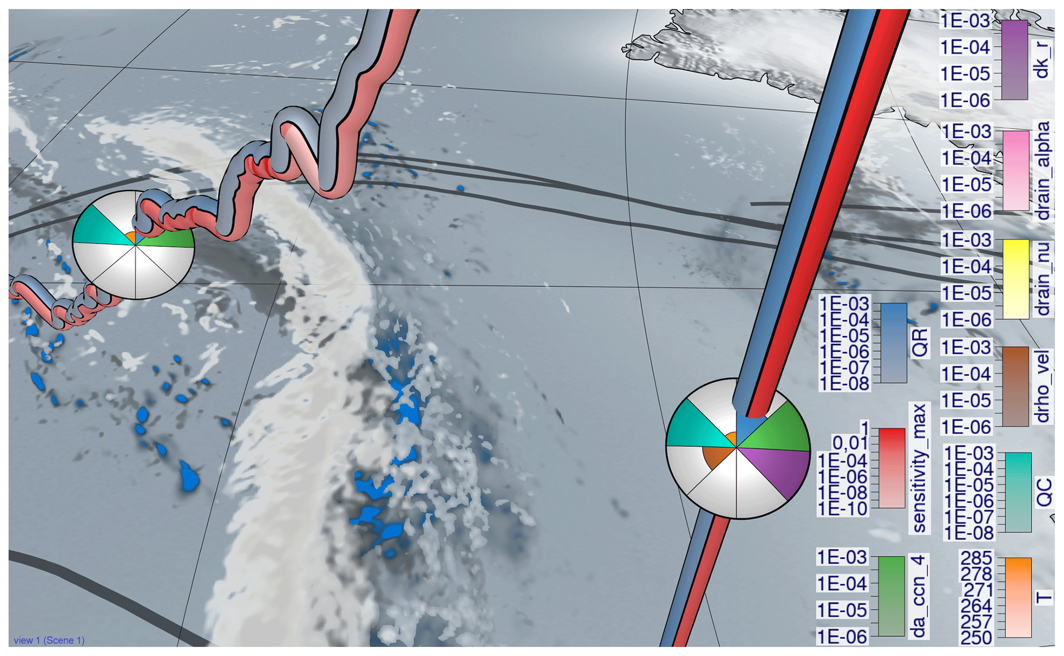
Figure 12View-aligned bands with multiple sensitivities for a convective trajectory. Zoom-in of a convective trajectory with the slantwise trajectory from Fig. 13 on the left. The green (sensitivity of rain mass density (QR) to a_ccn_4 associated with cloud droplet formation) and purple (sensitivity of QR to k_r associated with cloud droplet collision to form raindrops) sensitivities have simultaneously large values during the convective ascent, whereas only the green sensitivity is large in the slantwise ascent on the left.
Sensitivities of QR to CCN parameters and to k_r are ranked higher in the southern group, indicating that raindrop formation due to collisions of cloud droplets is closely related to local QR formation. These correlations are not present in the northern group, which indicates that local QR maxima result from the sedimentation of precipitation from above. We conclude that QR, specifically local maxima of QR, in the southern group is more closely related to the formation of cloud droplets and subsequent conversion to raindrops than in the northern group (Q3).
To elaborate on the spatiotemporal evolution of sensitivities (Q3), we investigate where along the trajectories any of the parameters is associated with the maximum sensitivity in Fig. 9. The blue color along trajectories shows QR, whereas red indicates the maximum sensitivity of QR to any parameter. Low sensitivity values (i.e., unsaturated bands) appear mostly when the trajectories descend and after they have reached their maximum height (Fig. 9a, b). This corroborates that processes influencing QR dominate during updrafts and at lower altitudes and are generally larger for faster-ascending WCB trajectories.
To further investigate which trajectories are related to large peaks in QR before the ascent starts, we use the spheres and move them slowly along the trajectories (Video 2, 3 min 21 s; Neuhauser and Hieronymus, 2023). Figure 11 shows a detailed view of one such trajectory. The position of the sphere indicates the current position of the air parcel, and the blue color corresponds to its QR. The blue shade on the ground is the surface precipitation shown at the same time as the air parcel location (i.e., at 81 h simulation time). The pink color on the sphere shows the sensitivity of QR to a parameter related to the sedimentation of rain and illustrates that QR is particularly sensitive to the model representation of rain sedimentation in regions with high QR. Video 2 (3 min 21 s; Neuhauser and Hieronymus, 2023) shows the spatial correlation between rainfall at the surface and the peaks in rain mass density for the bands in the background of Fig. 11, which are all trajectories that started in the south and with a strong ascent in the north.
5.2 Influence of ascent rate on parameter sensitivities
At last, we illustrate differences in sensitivities between convective and slantwise trajectories (Q5). Generally, QR and the associated parameter sensitivities are higher along convective ascending trajectories than along slantwise trajectories (Fig. 12; see Figs. 14 and 15). In the following, we illustrate examples of differences in parameter sensitivities, which are relevant for local precipitation characteristics.
First of all, QR is more sensitive to processes related to cloud droplet number concentration (a_ccn_4) and collision processes (k_r) along convective trajectories than along slantwise trajectories, prominently shown in Fig. 12. The color intensities of da_ccn_4 (sensitivity of QR to a_ccn_4; green) along slantwise ascending trajectories (e.g., Fig. 9a) are lower than for convective ones, which indicates that processes associated with a_ccn_4 have a minor effect on QR during slantwise ascent. Similarly, the collision of cloud droplets (sensitivity of QR to k_r; purple color) is more important during convective ascent. This agrees with our previous assessment and shows that the formation of cloud droplets and their subsequent conversion to QR are more important for QR along convective ascent than for slantwise ascent.
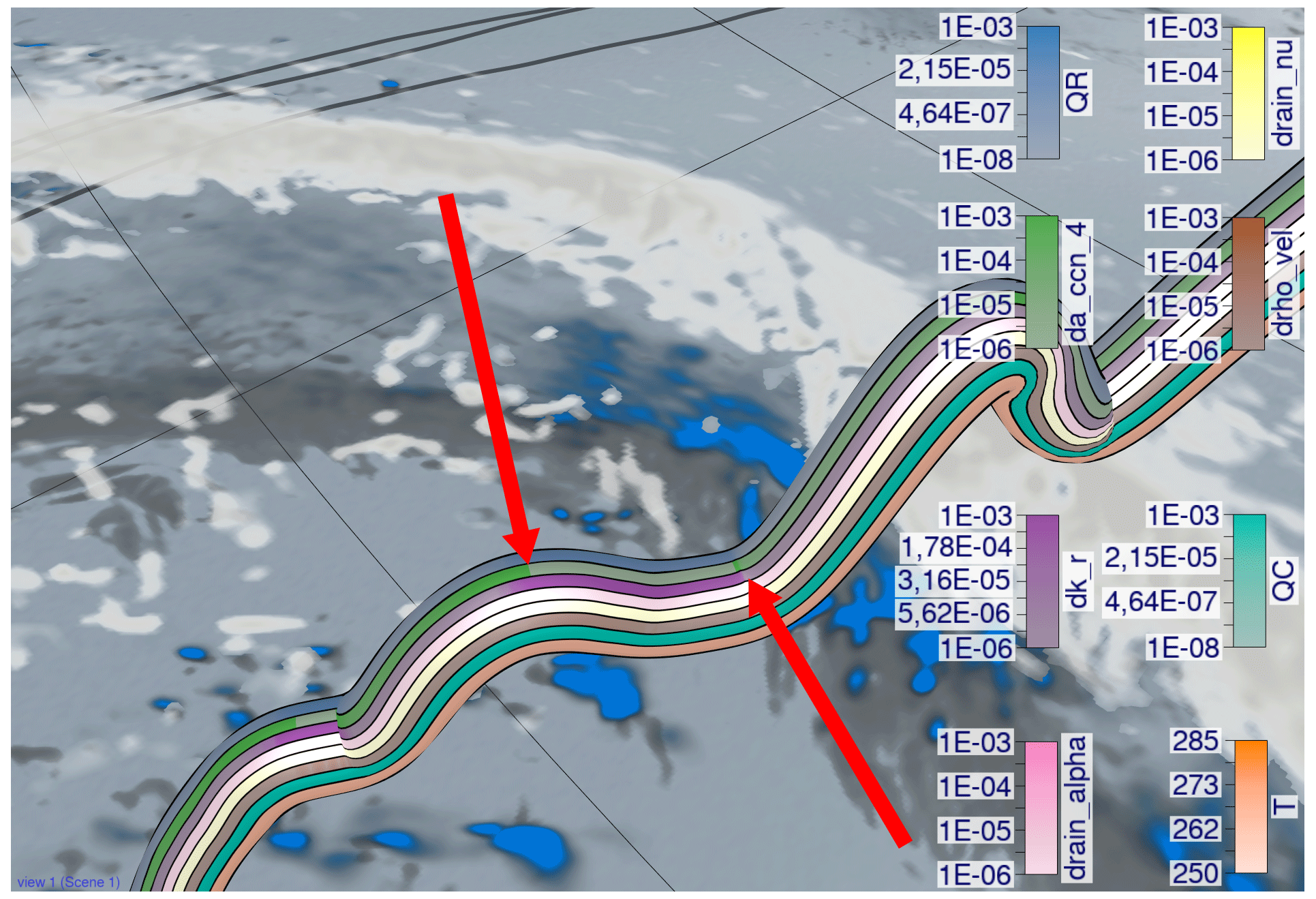
Figure 13View-aligned band and polar chart with multiple sensitivities for a slantwise trajectory. Zoom-in of a slantwise trajectory. The green band (sensitivity of rain mass density (QR) to a_ccn_4 associated with cloud droplet formation) alternates with the purple band (sensitivity of QR to k_r associated with cloud droplet collision to form raindrops).
For a more detailed analysis, we zoom in on a slantwise ascending trajectory and use multiple bands to show several parameters at once (see Fig. 13). Figure 13 reveals an alternating pattern between sensitivities of QR to k_r (purple) and a_ccn_4 (green). The overall slantwise ascent of the trajectory is characterized by short periods of sharp ascent with more pronounced cloud droplet formation. These periods are interrupted by periods of slower ascent and even descent, during which the collision of cloud droplets is the dominant sensitivity. These processes do not alternate in convective ascending trajectories (Fig. 12) but instead occur simultaneously. This can produce and accumulate large amounts of QR quickly (see Fig. 9c with convective trajectories in the foreground and slantwise trajectories in the background, all from group 2), leading to more intense surface precipitation in a limited area. In contrast, during slantwise ascent these processes are spread over a larger area. These illustrative examples are in line with previous studies on the impact of different ascent behavior on large-scale precipitation patterns in extratropical cyclones (Oertel et al., 2019, 2020, 2021; Jeyaratnam et al., 2020).
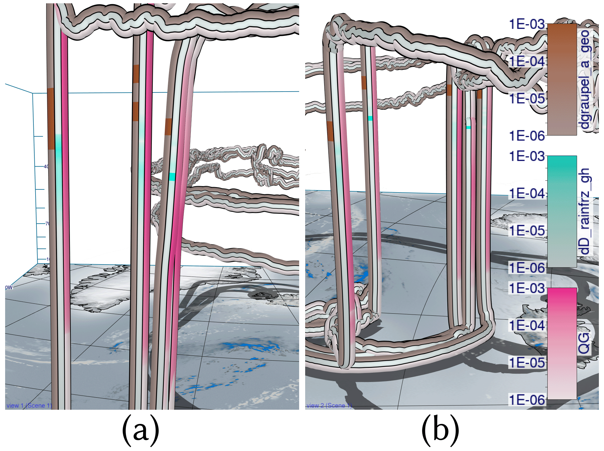
Figure 14View-aligned bands with multiple sensitivities for convective trajectories. Convective trajectories from the southern cluster (a) and the northern cluster (b) with sensitivities of rain mass density (QR) to graupel_a_geo and D_rainfrz_gh. Additionally, graupel mass density (QG; pink) is shown to highlight the amount of graupel that is present in convective trajectories. Sensitivities of QR to freezing and conversion of rain to graupel and hail are visible at higher altitudes for both clusters with clear graupel formation.
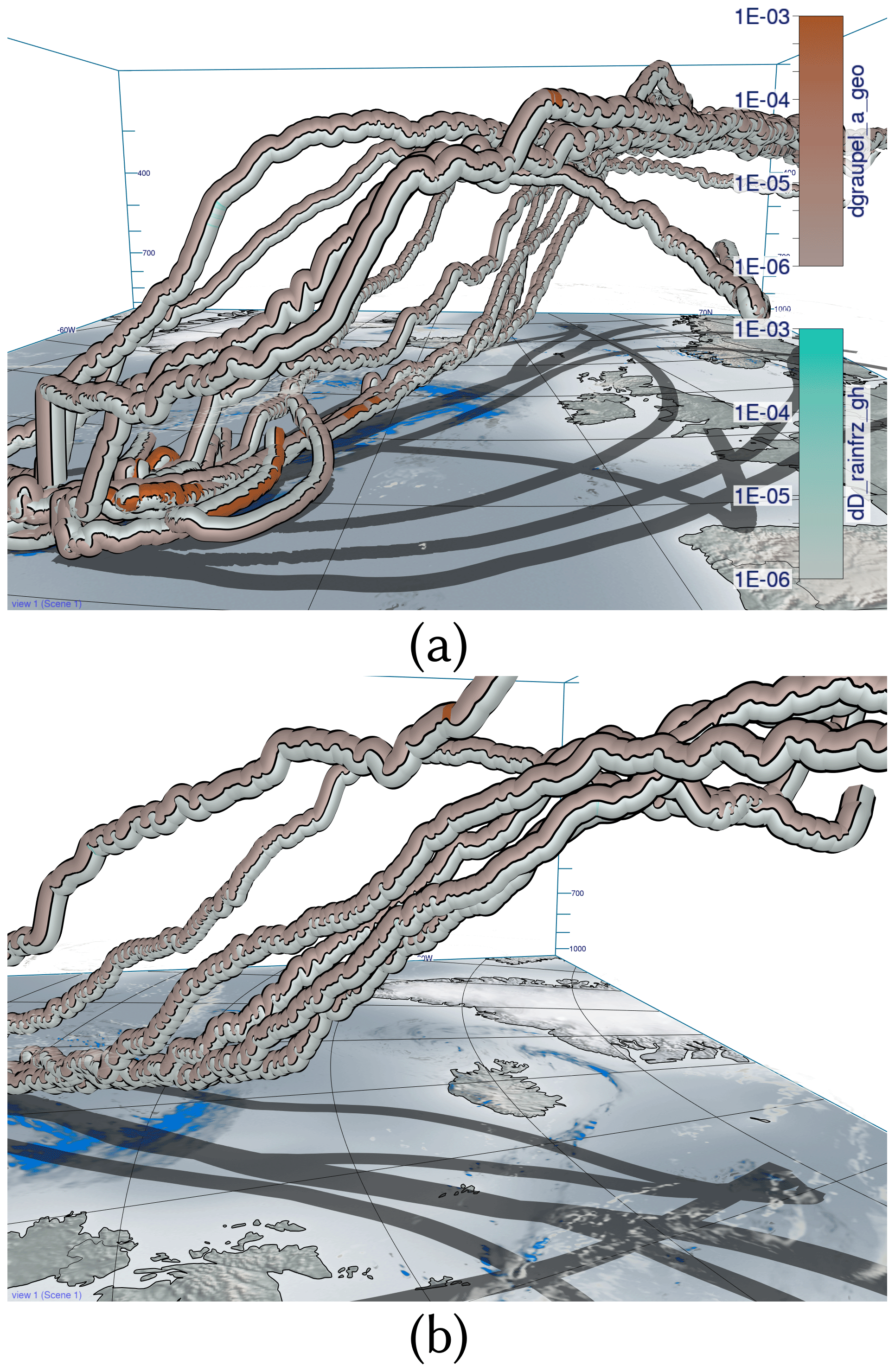
Figure 15View-aligned bands with multiple sensitivities for slantwise trajectories. Slantwise trajectories from the southern cluster (a) and the northern cluster (b) with sensitivities of rain mass density (QR) to graupel_a_geo (determines shape of graupel) and D_rainfrz_gh (determines the maximum size of graupel when raindrops freeze). Hardly any sensitivities are visible in contrast to convective trajectories in Fig. 14.
As a second example, Fig. 14 shows convective trajectories with sensitivities of rain mass density (QR) to graupel_a_geo (determines the shape of graupel) and D_rainfrz_gh (influences the maximum size of graupel when raindrops freeze). Large sensitivities of dD_rainfrz_gh (turquoise) emerge in both the northern cluster and southern cluster. Moreover, larger sensitivities to graupel_a_geo occur at low altitudes due to sedimentation and subsequent melting of graupel, which represents a source of QR. At higher altitudes and colder temperatures, where dD_rainfrz_gh becomes relevant (i.e., rain starts to freeze and is converted to graupel), the sensitivity to graupel_a_geo is more likely due to freezing of rain droplets. Due to the locally higher ascent velocity along convective trajectories, cloud droplets and raindrops are present at higher altitudes, which subsequently facilitates riming and graupel formation. In contrast, slantwise trajectories show hardly any sensitivity of QR to D_rainfrz_gh or graupel_a_geo, if any at all, as illustrated in Fig. 15. This difference, and the difference in graupel water content between convective and slantwise trajectories, emphasizes convective trajectories' role in forming graupel and hail. These differences highlight the convective trajectories' role for graupel formation, as well as the sensitivity of QR to the model representation of riming in convective conditions.
We propose a novel visual analysis workflow to investigate multiparameter properties along trajectories, here applied specifically to the relationships between the sensitivity of QR to changes in model parameters and the location and ascent behavior of WCB trajectories. This information is required to analyze the validity of physical assumptions on which microphysical parameterizations in the source code of NWP models are based. Making the sensitivities accessible along important Lagrangian features, such as WCB trajectories, offers new insights into the correlation structures between different parameters and differences between trajectories. To perform these analyses in an effective way, we link a curve-plot-based summary view with a novel sphere-based focus view that enables comparison of multiparameter distributions on different trajectories. The curve plot view provides statistical overviews and enables us to quickly find parameters with a similar temporal evolution. We develop the workflow in a team of scientists from visualization, high-performance computing and meteorology and integrate it into the open-source meteorological visualization software Met.3D. The usability and benefits of the workflow are demonstrated with a real-world case study.
We investigated trajectories associated with extratropical Cyclone Vladiana that ascended between 23 September 2016 and 26 September 2016. Our investigation revealed that trajectories with their fastest ascent in the northern region are more susceptible to rain sedimentation from above than trajectories ascending further south (Q3). The occurrence of sensitivity peaks at different times relative to the fastest ascent of these trajectories illustrates this phenomenon. In contrast, rain mass density in trajectories from the southern region exhibits a higher sensitivity to parameters related to CCN activation and cloud droplet collision, indicating a localized formation of rain droplets (Q3) and notable uncertainties in the shape of clouds and subsequent rainfall. When focusing on the time of their fastest ascent, the overall variation in sensitivities in trajectories from the south and north becomes more prominent compared to the variation observed between trajectories from similar locations (Q4). Cloud droplets' formation and subsequent transformation into rain droplets are more pronounced along convective ascending trajectories than in slantwise ascents. Slantwise ascending trajectories are characterized by slower ascent and even descent periods, during which cloud and rain droplets form alternately (Q1, Q2). This alternating pattern gives rise to large-scale precipitation patterns, whereas convective ascending trajectories do not exhibit such a pattern (Q5). Accordingly, uncertainty in large-scale precipitation patterns arises from slantwise ascending trajectories. The strong ascent of convective trajectories results in significant sensitivities of rain mass density to riming and freezing parameters at higher altitudes, which are barely present in slantwise ascending trajectories (Q5). We can conclude that graupel and hail mass uncertainty comes from convective ascents.
Our approach can be further extended in multiple ways. First, it would be beneficial to investigate how to effectively show additional 3-D atmospheric fields, or features in these fields, in the surroundings of trajectories to reveal specific regional multi-field patterns causing high sensitivities. Second, the workflow could be made usable with ensembles of trajectories, where multiple sets of trajectories from different simulation runs are considered. In this way, relationships between sensitivities and the ensemble spread can be examined. Third, it would be interesting to support multiple target variables that can be switched interactively.
To obtain a renderable trajectory representation, the trajectories (i.e., 3-D pathlines) are polygonized by extruding them into tubes in a GPU geometry shader. The parameters are mapped onto the surface of the tube as a set of bands running in the direction of the trajectory tangent (see Fig. 8). When mapping the bands onto the tube in object space, occlusion effects can occur, as not all parameters may lie in the front, visible part of the tube. Also, due to twist and rotations around the tube, the order in which the bands appear on screen can change and make a comparison between different tubes and the association of parameters to bands more difficult (see Fig. 6a). To avoid this, our rendering technique aligns the bands in view space and keeps their relative order on the screen fixed, independent of the viewing direction (see Fig. 6b). For this, a screen space band position dband is computed in the pixel shader on the GPU using only the tangent vector t of the pathline associated with the tube surface fragment, the surface normal n and the view vector pointing from the fragment towards the camera position pcam as inputs.
By projecting the camera view direction into the plane orthogonal to the tangent direction of the trajectory, the problem of computing the band position can be reduced to a 2-D problem. The projected camera direction v′ can be computed by using as . The resulting setting is shown in Fig. A1.
Using the angle between the projected view vector v′ and the normal vector n would unfortunately not be sufficient as a measure because it does not change linearly in screen space, thus producing bands of differing width. In order to derive the desired screen space measure, the fragment position needs to be projected onto an imaginary band, illustrated as the vertical line in Fig. A1. As can be seen in the figure, the normalized distance of the projected point to the center of the band amounts to the sine of the angle ϕ. In order to compute the sine, one of the two equalities below can be used.
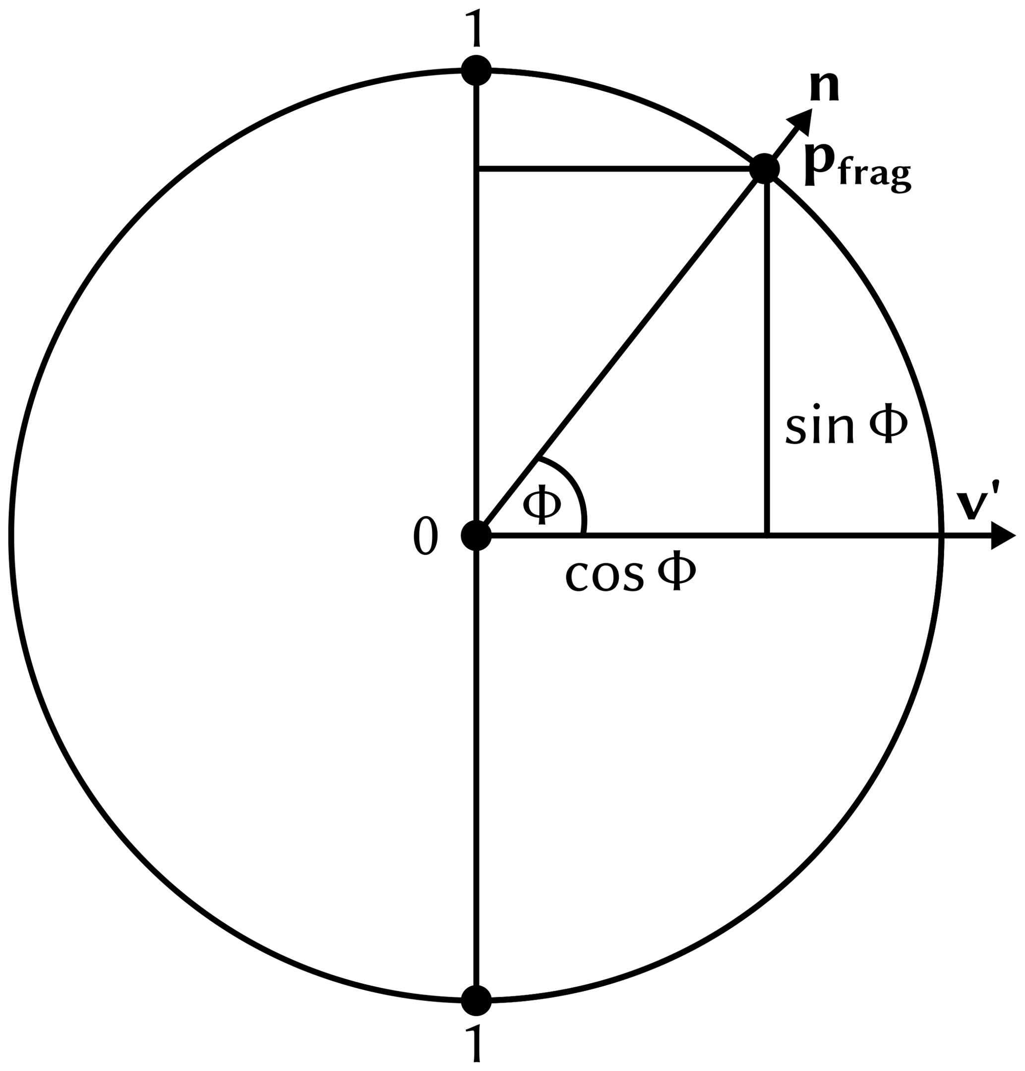
Figure A1Cross section of the tube with the plane perpendicular to the tangent vector t of the pathline.
These statements hold due to the following mathematical properties of the sine, cosine, cross product and scalar product.
As a final step, the resulting distance needs to be corrected, as the absolute value of the sine does not go from 0 to 1 from one end of the imaginary band to the other but from 1 to 0 in the middle and back to 1 at the other side. In order to correct this problem, we need to compute the sign of the sine by using the winding direction of the angle ϕ. The sign of the sine can be computed as the sign of the volume of the parallelepiped spanned by t, v′ and n.
The equality of the determinant and the combination of the scalar product and cross product can be proven by the simple expansion of the respective formulas using the three input vector coordinates as variables. Finally, we can compute the screen space band measure we are looking for as
When mapping N parameters onto the tube, we subdivide the band position into multiple sub-band positions dsub. For this, we compute the variable ID and then finally (see Fig. 8).
For the rendering of a sphere colored via polar charts, we want to subdivide the screen projection of the sphere in angular bands, i.e., individual polar sectors (see Fig. B1). For this, we want to compute the angle αsector, which represents the angular distance of the fragment pfrag to the up axis of the camera. As input, we need the surface normal vector n, the camera view direction v and the camera up-vector u. As a first step, the normal n is projected into the view plane to obtain
Then, we set . The length is the normalized screen space distance to the center of the sphere. This can be easily checked for the special case , where becomes . We will use this fact later in Eq. (B5). In the next step, we compute the angle αsector as follows:
where atan2(y,x) computes the angle between the positive x axis and the line connecting the origin and the point (x,y)T, and atan2 returns the angle in a mathematically positive direction, i.e., a counterclockwise angle. However, in our case, we do not want the counterclockwise angle from the positive x axis but rather the clockwise angle from the positive y axis (the positive y axis being the up vector of the camera). This can be most easily achieved by transposing (i.e., interchanging) the x and y coordinates we feed to atan2. To get the y coordinate of the point we use for calculating the angle, the term is used in Eq. (B2). In this way, we project the view plane normal onto the up axis vector. For the x coordinate, is used. We can again use Eq. (A7) to get the equality . Here, u×v can be interpreted as the right axis vector of the view plane. When we project the view plane normal onto this new right axis vector, we get the x coordinate for Eq. (B2). The polar chart in the view plane can be seen in Fig. B1.
Finally, we can compute the global sector position dsector as
When mapping N parameters onto the sphere, we again subdivide the sector position into multiple subsector positions dsub (see Fig. B1).
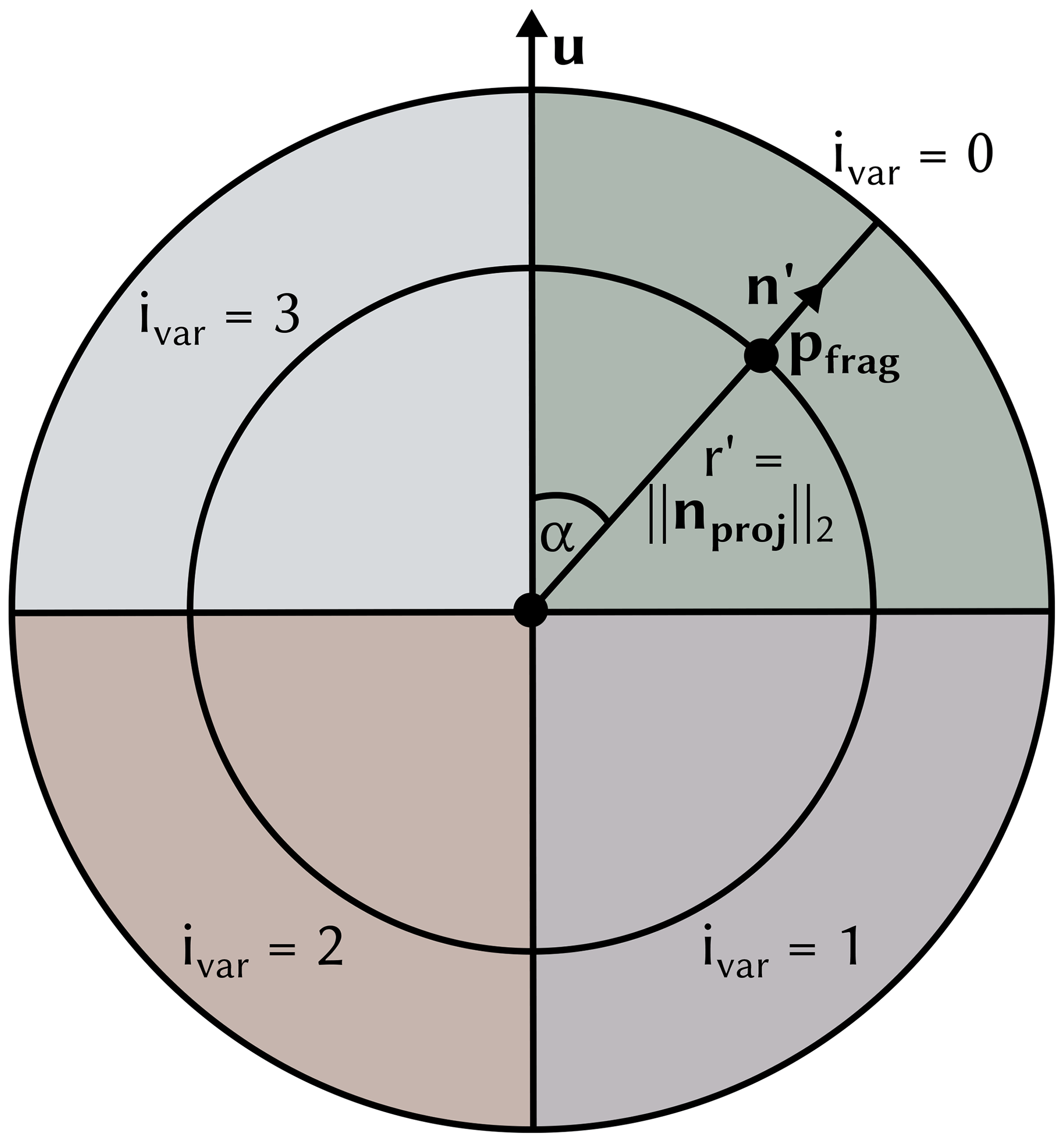
Figure B1Illustration of how the input vectors and points on the sphere are used to compute the sector position dsector, the subsector position dsector and its corresponding variable ID ivar.
A black separator line is drawn between two neighboring subsectors. A problem that also arises for the polar-chart-based spheres is that changes in the subsector position are not linear in screen space but are dependent on the distance to the screen space center of the sphere. Consequently, two correction factors are introduced below, and the final separator thickness is computed as
The factor f1 is equal to , which itself, as was shown earlier in this section, is equal to the normalized distance to the screen space center of the sphere. In this way, it is guaranteed that the separator thickness does not get thinner the closer we get to the center of the polar chart.
Finally, the factor f2 is used to make sure that the separator thickness of the polar chart sphere and the trajectory tube match. For this, the circumference of the sphere 2rπ is divided by the width of the tube wtube.
If the polar color chart visualization mapping introduced in Sect. 3.2 is used, the value of the individual variables displayed in the sectors is mapped to the saturation of the colors. If the polar area chart mapping is used, the radius r′ is used to determine whether to render the point in color depending on the magnitude of the variables.
The implementation of the visualization techniques described in this work is available in a fork of the open-source 3-D visualization system Met.3D at https://github.com/chrismile/met.3d (last access: 9 August 2023) under the terms of the GNU General Public License v3.0 (GPL-3.0). Version 1.6.0-multivar1 of this software is archived at https://doi.org/10.5281/zenodo.8082371 (Neuhauser et al., 2023). The trajectory data used for the realization of the figures and the case study are archived at https://doi.org/10.5281/zenodo.8043592 (Hieronymus and Oertel, 2023) under the terms of the Creative Commons Attribution 4.0 International License. The algorithmic differentiation code used for the generation of these data is described in Hieronymus et al. (2022) and made available at https://doi.org/10.5281/zenodo.6645540 (Hieronymus, 2022) under the terms of the MIT License.
Two video supplements showcasing the functionality of the visualization techniques described in this work (Video 1) and illustrating the analysis of the Vladiana WCB trajectories (Video 2) are available at https://doi.org/10.5281/zenodo.8085134 (Neuhauser and Hieronymus, 2023).
CN, MH, MR, AO and RW wrote the manuscript. CN implemented the proposed visualization methods, wrote the sections of the manuscript regarding the methodology and created the figures except for those for the case study. RW, CN and MK conceived the idea. MH provided the simulated trajectory data. MH, MR and AO performed the case study and the meteorological analyses. RW supervised the work.
The contact author has declared that none of the authors has any competing interests.
Publisher’s note: Copernicus Publications remains neutral with regard to jurisdictional claims in published maps and institutional affiliations.
The authors acknowledge support by the Deutsche Forschungsgemeinschaft (DFG) within the Transregional Collaborative Research Centre TRR165 Waves to Weather (https://www.wavestoweather.de/, last access: 9 August 2023) projects A7, Z2, B8 and C9.
This research has been supported by the Deutsche Forschungsgemeinschaft (grant no. SFB/TRR165) and the Johannes Gutenberg-Universität Mainz.
This work was supported by the Technical University of Munich (TUM) in the framework of the Open Access Publishing Program.
This paper was edited by Nina Crnivec and reviewed by two anonymous referees.
Afzal, S., Hittawe, M., Ghani, S., Jamil, T., Knio, O., Hadwiger, M., and Hoteit, I.: The State of the Art in Visual Analysis Approaches for Ocean and Atmospheric Datasets, Comput. Graph. Forum, 38, 881–907, https://doi.org/10.1111/cgf.13731, 2019. a
Bader, R., Sprenger, M., Ban, N., Radisuhli, S., Schar, C., and Günther, T.: Extraction and Visual Analysis of Potential Vorticity Banners around the Alps, IEEE T. Vis. Comput. Gr., 26, 259–269, https://doi.org/10.1109/TVCG.2019.2934310, 2019. a
Baldauf, M., Seifert, A., Förstner, J., Majewski, D., Raschendorfer, M., and Reinhardt, T.: Operational Convective-Scale Numerical Weather Prediction with the COSMO Model: Description and Sensitivities, Mon. Weather Rev., 139, 3887–3905, https://doi.org/10.1175/MWR-D-10-05013.1, 2011. a
Barklie, R. H. D. and Gokhale, N. R.: The freezing of supercooled water drops, Stormy Weather Group, McGill Univ., Sci. Rep. MW-30, Part 3, 43–64, 1959. a
Baumgartner, M., Sagebaum, M., Gauger, N. R., Spichtinger, P., and Brinkmann, A.: Algorithmic differentiation for cloud schemes (IFS Cy43r3) using CoDiPack (v1.8.1), Geosci. Model Dev., 12, 5197–5212, https://doi.org/10.5194/gmd-12-5197-2019, 2019. a
Beckert, A. A., Eisenstein, L., Oertel, A., Hewson, T., Craig, G. C., and Rautenhaus, M.: The three-dimensional structure of fronts in mid-latitude weather systems in numerical weather prediction models, Geosci. Model Dev., 16, 4427–4450, https://doi.org/10.5194/gmd-16-4427-2023, 2023. a
Bösiger, L., Sprenger, M., Boettcher, M., Joos, H., and Günther, T.: Integration-based extraction and visualization of jet stream cores, Geosci. Model Dev., 15, 1079–1096, https://doi.org/10.5194/gmd-15-1079-2022, 2022. a
Chen, L., Özsu, M. T., and Oria, V.: Robust and Fast Similarity Search for Moving Object Trajectories, in: Proceedings of the 2005 ACM SIGMOD International Conference on Management of Data, SIGMOD '05, 491–502, Association for Computing Machinery, New York, NY, USA, June 2005, https://doi.org/10.1145/1066157.1066213, 2005. a
Gong, X., Si, Y.-W., Fong, S., and Mohammed, S.: NSPRING: Normalization-supported SPRING for subsequence matching on time series streams, in: 2014 IEEE 15th International Symposium on Computational Intelligence and Informatics (CINTI), Budapest, Hungary, November 2014, 373–378, https://doi.org/10.1109/CINTI.2014.7028704, 2014. a
Griewank, A. and Walther, A.: Evaluating Derivatives: Principles and Techniques of Algorithmic Differentiation, second edn., SIAM, https://doi.org/10.1137/1.9780898717761, 2008. a
Hande, L. B., Engler, C., Hoose, C., and Tegen, I.: Parameterizing cloud condensation nuclei concentrations during HOPE, Atmos. Chem. Phys., 16, 12059–12079, https://doi.org/10.5194/acp-16-12059-2016, 2016. a, b, c, d, e, f, g, h, i, j, k, l
Harrower, M. and Brewer, C. A.: ColorBrewer.org: An Online Tool for Selecting Colour Schemes for Maps, Cartogr. J., 40, 27–37, https://doi.org/10.1179/000870403235002042, 2003. a
He, J., Chen, H., Chen, Y., Tang, X., and Zou, Y.: Diverse Visualization Techniques and Methods of Moving-Object-Trajectory Data: A Review, ISPRS Int. J. Geo-Inf., 8, 63, https://doi.org/10.3390/ijgi8020063, 2019. a
Hieronymus, M.: wavestoweather/AD_Sensitivity_Analysis: Source for Reference Paper, Zenodo [code], https://doi.org/10.5281/zenodo.6645540, 2022. a
Hieronymus, M. and Oertel, A.: Trajectory Data with Sensitivities to Cloud Microphysical Parameters, Zenodo [data set], https://doi.org/10.5281/zenodo.8043592, 2023. a
Hieronymus, M., Baumgartner, M., Miltenberger, A., and Brinkmann, A.: Algorithmic Differentiation for Sensitivity Analysis in Cloud Microphysics, J. Adv. Model. Earth Sy., 14, e2021MS002849, https://doi.org/10.1029/2021MS002849, 2022. a, b, c, d, e, f, g, h, i, j
Jeyaratnam, J., Booth, J. F., Naud, C. M., Luo, Z. J., and Homeyer, C. R.: Upright Convection in Extratropical Cyclones: A Survey Using Ground‐Based Radar Data Over the United States, Geophys. Res. Lett., 47, e2019GL086620, https://doi.org/10.1029/2019GL086620, 2020. a, b
Joos, H. and Forbes, R. M.: Impact of different IFS microphysics on a warm conveyor belt and the downstream flow evolution, Q. J. Roy. Meteor. Soc., 142, 2727–2739, https://doi.org/10.1002/qj.2863, 2016. a
Kappe, C., Böttinger, M., and Leitte, H.: Topology-Based Feature Analysis of Scalar Field Ensembles: An Application to Climate (Change) Analysis, Comput. Graph., 104, 59–71, https://doi.org/10.1016/j.cag.2022.03.004, 2022. a
Kärcher, B., Hendricks, J., and Lohmann, U.: Physically based parameterization of cirrus cloud formation for use in global atmospheric models, J. Geophys. Res.-Atmos., 111, D01205, https://doi.org/10.1029/2005JD006219, 2006. a
Kern, M., Hewson, T., Sadlo, F., Westermann, R., and Rautenhaus, M.: Robust Detection and Visualization of Jet-stream Core Lines in Atmospheric Flow, IEEE T. Vis. Comput. Gr., 24, 893–902, https://doi.org/10.1109/tvcg.2017.2743989, 2018. a
Kern, M., Hewson, T., Schatler, A., Westermann, R., and Rautenhaus, M.: Interactive 3D Visual Analysis of Atmospheric Fronts, IEEE T. Vis. Comput. Gr., 25, 1080–1090, https://doi.org/10.1109/TVCG.2018.2864806, 2019. a
Leutbecher, M. and Palmer, T.: Ensemble Forecasting, J. Comput. Phys., 227, 3515–3539, https://doi.org/10.1016/j.jcp.2007.02.014, 2008. a
Love, A. L., Pang, A., and Kao, D. L.: Visualizing spatial multivalue data, IEEE Computer Graphics and Applications, 25, 69–79, 2005. a
Madonna, E., Wernli, H., Joos, H., and Martius, O.: Warm Conveyor Belts in the ERA-Interim Dataset (1979–2010). Part I: Climatology and Potential Vorticity Evolution, J. Climate, 27, 3–26, https://doi.org/10.1175/JCLI-D-12-00720.1, 2014. a, b
Mazoyer, M., Ricard, D., Rivière, G., Delanoë, J., Arbogast, P., Vié, B., Lac, C., Cazenave, Q., and Pelon, P.: Microphysics Impacts on the Warm Conveyor Belt and Ridge Building of the NAWDEX IOP6 Cyclone, Mon. Weather Rev., 149, 3961–3980, https://doi.org/10.1175/MWR-D-21-0061.1, 2021. a
Meyer, M., Polkova, I., Modali, K. R., Schaffer, L., Baehr, J., Olbrich, S., and Rautenhaus, M.: Interactive 3-D visual analysis of ERA5 data: improving diagnostic indices for marine cold air outbreaks and polar lows, Weather Clim. Dynam., 2, 867–891, https://doi.org/10.5194/wcd-2-867-2021, 2021. a
Miltenberger, A. K., Pfahl, S., and Wernli, H.: An online trajectory module (version 1.0) for the nonhydrostatic numerical weather prediction model COSMO, Geosci. Model Dev., 6, 1989–2004, https://doi.org/10.5194/gmd-6-1989-2013, 2013. a
Munzner, T.: Visualization Analysis and Design, chap. 5, 1 edn., A K Peters/CRC Press, https://doi.org/10.1201/b17511, 2014. a
Neuhauser, C. and Hieronymus, M.: Supplementary videos for the paper “Visual analysis of model parameter sensitivities along warm conveyor belt trajectories”, Zenodo [video], https://doi.org/10.5281/zenodo.8085134, 2023. a, b, c, d, e, f, g, h, i, j
Neuhauser, C., Wang, J., Kern, M., and Westermann, R.: Efficient High-Quality Rendering of Ribbons and Twisted Lines, in: Vision, Modeling, and Visualization, The Eurographics Association, 135–1439, https://doi.org/10.2312/vmv.20221213, 2022. a, b
Neuhauser, C., Hieronymus, M., Kern, M., and Met.3D Contributors: chrismile/met.3d: 1.6.0-multivar1, Zenodo [code], https://doi.org/10.5281/zenodo.8082371, 2023. a
Nguyen, D. B., Zhang, L., Laramee, R. S., Thompson, D., Monico, R. O., and Chen, G.: Unsteady Flow Visualization via Physics Based Pathline Exploration, in: 2019 IEEE Visualization Conference (VIS), Vancouver, BC, Canada, October 2019, 286–290, https://doi.org/10.1109/VISUAL.2019.8933578, 2019. a
Nguyen, D. B., Zhang, L., Laramee, R. S., Thompson, D., Monico, R. O., and Chen, G.: Physics-based Pathline Clustering and Exploration, Comput. Graph. Forum, 40, 22–37, https://doi.org/10.1111/cgf.14093, 2021. a
Oertel, A., Boettcher, M., Joos, H., Sprenger, M., Konow, H., Hagen, M., and Wernli, H.: Convective activity in an extratropical cyclone and its warm conveyor belt – a case‐study combining observations and a convection‐permitting model simulation, Q. J. Roy. Meteor. Soc., 145, 1406–1426, https://doi.org/10.1002/qj.3500, 2019. a, b
Oertel, A., Boettcher, M., Joos, H., Sprenger, M., and Wernli, H.: Potential vorticity structure of embedded convection in a warm conveyor belt and its relevance for large-scale dynamics, Weather Clim. Dynam., 1, 127–153, https://doi.org/10.5194/wcd-1-127-2020, 2020. a, b, c, d
Oertel, A., Sprenger, M., Joos, H., Boettcher, M., Konow, H., Hagen, M., and Wernli, H.: Observations and simulation of intense convection embedded in a warm conveyor belt – how ambient vertical wind shear determines the dynamical impact, Weather Clim. Dynam., 2, 89–110, https://doi.org/10.5194/wcd-2-89-2021, 2021. a, b
Ollinaho, P., Lock, S.-J., Leutbecher, M., Bechtold, P., Beljaars, A., Bozzo, A., Forbes, R. M., Haiden, T., Hogan, R. J., and Sandu, I.: Towards process-level representation of model uncertainties: stochastically perturbed parametrizations in the ECMWF ensemble, Q. J. Roy. Meteor. Soc., 143, 408–422, https://doi.org/10.1002/qj.2931, 2017. a
Orf, L., Wilhelmson, R., Lee, B., Finley, C., and Houston, A.: Evolution of a Long-Track Violent Tornado within a Simulated Supercell, B. Am. Meteorol. Soc., 98, 45–68, https://doi.org/10.1175/bams-d-15-00073.1, 2016. a
Pfahl, S., Madonna, E., Boettcher, M., Joos, H., and Wernli, H.: Warm Conveyor Belts in the ERA-Interim Dataset (1979–2010). Part II: Moisture Origin and Relevance for Precipitation, J. Climate, 27, 27–40, https://doi.org/10.1175/JCLI-D-13-00223.1, 2014. a
Phillips, V. T. J., DeMott, P. J., and Andronache, C.: An Empirical Parameterization of Heterogeneous Ice Nucleation for Multiple Chemical Species of Aerosol, J. Atmos. Sci, 65, 2757–2783, https://doi.org/10.1175/2007JAS2546.1, 2008. a
Pickl, M., Lang, S. T. K., Leutbecher, M., and Grams, C. M.: The effect of stochastically perturbed parametrisation tendencies (SPPT) on rapidly ascending air streams, Q. J. Roy. Meteor. Soc., 148, 1242–1261, https://doi.org/10.1002/qj.4257, 2022. a
Potter, K., Kniss, J., Riesenfeld, R., and Johnson, C. R.: Visualizing Summary Statistics and Uncertainty, Comput. Graph. Forum, 29, 823–832, https://doi.org/10.1111/j.1467-8659.2009.01677.x, 2010. a
Rao, R. and Card, S. K.: The Table Lens: Merging Graphical and Symbolic Representations in an Interactive Focus + Context Visualization for Tabular Information, in: Proceedings of the SIGCHI Conference on Human Factors in Computing Systems, CHI '94, Association for Computing Machinery, New York, NY, USA, Boston, Massachusetts, USA, April 1994, 318–322, https://doi.org/10.1145/191666.191776, 1994. a
Rautenhaus, M., Grams, C. M., Schäfler, A., and Westermann, R.: Three-dimensional visualization of ensemble weather forecasts – Part 2: Forecasting warm conveyor belt situations for aircraft-based field campaigns, Geosci. Model Dev., 8, 2355–2377, https://doi.org/10.5194/gmd-8-2355-2015, 2015a. a, b, c
Rautenhaus, M., Kern, M., Schäfler, A., and Westermann, R.: Three-dimensional visualization of ensemble weather forecasts – Part 1: The visualization tool Met.3D (version 1.0), Geosci. Model Dev., 8, 2329–2353, https://doi.org/10.5194/gmd-8-2329-2015, 2015b. a
Rautenhaus, M., Bottinger, M., Siemen, S., Hoffman, R., Kirby, R. M., Mirzargar, M., Röber, N., and Westermann, R.: Visualization in Meteorology – A Survey of Techniques and Tools for Data Analysis Tasks, IEEE Trans. Visual. Comput. Graphics, 24, 3268–3296, https://doi.org/10.1109/tvcg.2017.2779501, 2018. a, b
Russig, B., Graß, D., Dachselt, R., and Gumhold, S.: On-Tube Attribute Visualization for Multivariate Trajectory Data, IEEE T. Vis. Comput. Gr., 29, 1288–1298, https://doi.org/10.1109/TVCG.2022.3209400, 2023. a, b
Sadlo, F., Peikert, R., and Sick, M.: Visualization Tools for Vorticity Transport Analysis in Incompressible Flow, IEEE T. Vis. Comput. Gr., 12, 949–956, https://doi.org/10.1109/TVCG.2006.199, 2006. a
Sagebaum, M., Albring, T., and Gauger, N. R.: High-Performance Derivative Computations using CoDiPack, ACM Trans. Math. Softw., 45, 38, https://doi.org/10.1145/3356900, 2019. a
Sakurai, Y., Faloutsos, C., and Yamamuro, M.: Stream Monitoring under the Time Warping Distance, in: 2007 IEEE 23rd International Conference on Data Engineering, Istanbul, Turkey, April 2007, 1046–1055, https://doi.org/10.1109/ICDE.2007.368963, 2007. a
Sanyal, J., Zhang, S., Dyer, J., Mercer, A., Amburn, P., and Moorhead, R.: Noodles: A tool for visualization of numerical weather model ensemble uncertainty, IEEE T. Vis. Comput. Gr., 16, 1421–1430, 2010. a
Schäfler, A., Craig, G., Wernli, H., Arbogast, P., Doyle, J. D., McTaggart-Cowan, R., Methven, J., Rivière, G., Ament, F., Boettcher, M., Bramberger, M., Cazenave, Q., Cotton, R., Crewell, S., Delanoë, J., Dörnbrack, A., Ehrlich, A., Ewald, F., Fix, A., Grams, C. M., Gray, S. L., Grob, H., Groß, S., Hagen, M., Harvey, B., Hirsch, L., Jacob, M., Kölling, T., Konow, H., Lemmerz, C., Lux, O., Magnusson, L., Mayer, B., Mech, M., Moore, R., Pelon, J., Quinting, J., Rahm, S., Rapp, M., Rautenhaus, M., Reitebuch, O., Reynolds, C. A., Sodemann, H., Spengler, T., Vaughan, G., Wendisch, M., Wirth, M., Witschas, B., Wolf, K., and Zinner, T.: The North Atlantic Waveguide and Downstream Impact Experiment, B. Am. Meteorol. Soc., 99, 1607–1637, https://doi.org/10.1175/BAMS-D-17-0003.1, 2018. a, b
Seifert, A.: On the Parameterization of Evaporation of Raindrops as Simulated by a One-Dimensional Rainshaft Model, J. Atmos. Sci, 65, 3608–3619, https://doi.org/10.1175/2008JAS2586.1, 2008. a, b, c
Seifert, A. and Beheng, K. D.: A two-moment cloud microphysics parameterization for mixed-phase clouds. Part 1: Model description, Meteorol. Atmos. Phys., 92, 45–66, https://doi.org/10.1007/s00703-005-0112-4, 2006. a, b, c, d, e, f, g, h, i, j, k, l, m, n, o, p, q, r, s, t, u, v, w
Steinarsson, S.: Downsampling Time Series for Visual Representation, Master's thesis, University of Iceland, https://skemman.is/bitstream/1946/15343/3/SS_MSthesis.pdf (last access: 9 August 2023), 2013. a
Stevens, S. S.: Psychophysics: Introduction to Its Perceptual, Neural, and Social Prospects, p. 103, 104, 115, Wiley, ISBN 9780471824374, 1975. a
Stoll, C., Gumhold, S., and Seidel, H.-P.: Visualization with stylized line primitives, in: VIS 05. IEEE Visualization, Minneapolis, MN, USA, October 2005, 2005, 695–702, https://doi.org/10.1109/VISUAL.2005.1532859, 2005. a
Toyoda, M. and Sakurai, Y.: Subsequence Matching in Data Streams, NTT Technical Review, 11, 208–208, 2013. a
Wang, J., Hazarika, S., Li, C., and Shen, H.: Visualization and Visual Analysis of Ensemble Data: A Survey, IEEE T. Vis. Comput. Gr., 25, 2853–2872, https://doi.org/10.1109/TVCG.2018.2853721, 2018. a
Wernli, H.: A lagrangian-based analysis of extratropical cyclones. II: A detailed case-study, Q. J. Roy. Meteor. Soc., 123, 1677–1706, https://doi.org/10.1002/qj.49712354211, 1997. a, b
Yoshizumi, A., Coffer, M. M., Collins, E. L., Gaines, M. D., Gao, X., Jones, K., McGregor, I. R., McQuillan, K. A., Perin, V., Tomkins, L. M., Worm, T., and Tateosian, L.: A Review of Geospatial Content in IEEE Visualization Publications, in: 2020 IEEE Visualization Conference (VIS), 51–55, Salt Lake City, UT, USA, October 2020, https://doi.org/10.1109/VIS47514.2020.00017, 2020. a
- Abstract
- Introduction
- Data and method overview
- Visualization techniques
- Implementation
- Results: case study Vladiana
- Conclusions
- Appendix A: Tube rendering
- Appendix B: Polar-chart-based sphere rendering
- Appendix C: Variable and parameter names
- Code and data availability
- Video supplement
- Author contributions
- Competing interests
- Disclaimer
- Acknowledgements
- Financial support
- Review statement
- References